mindmap
  root((Regression
  Analysis)
    Continuous <br/>Outcome Y
      {{Unbounded <br/>Outcome Y}}
        )Chapter 3: <br/>Ordinary <br/>Least Squares <br/>Regression(
          (Normal <br/>Outcome Y)
    Discrete <br/>Outcome Y
3 Ordinary Least-squares Regression
When to Use and Not Use Ordinary Least-squares Regression
Ordinary Least-squares regression is a classical linear model that is appropriately used under the following conditions:
- The outcome variable is continuous and unbounded (ideally unbounded, though this is not strictly enforced), as illustrated in Figure 3.1. Examples of such variables include temperature, pressure differences, electrical voltages, monetary profits or losses, and net changes in blood pressure. Note that the outcome should not be a count variable, which is of discrete type.
- We assume a linear relationship between the observed regressors (\(x\)s) and the outcome (\(Y\)).
- Our data points do not exhibit any correlation structures, which means there is statistical independence across the sampled observations.
- The variance associated with the random noise governing our observed modelling residuals is constant; this condition is known as homoscedasticity.
- For inferential purposes, we assume that the probability distribution of the random noise (governing our observed modelling residuals) is Normal.
- Our data points do not contain extreme observations; in other words, there are no outliers.
However, Ordinary Least-squares regression regression should not be used in the following scenarios:
- The outcome variable can be either discrete or unbounded. However, as previously mentioned, the unbounded characteristic of the continuous outcome is not strictly enforced in this regression model. For discrete outcomes, you can refer to the regression models found in the “discrete cuisine” of this book. On the other hand, for continuous and unbounded outcomes, you can consult the section on Gamma regression (see Chapter 4).
- We assume a non-linear relationship between the observed regressors (\(x\)s) and the outcome variable (\(Y\)). An alternative approach is to use a generalized additive model (GAM), as introduced by Hastie and Tibshirani (1986). A useful resource on GAMs can be found in Clark (2022).
- Our data points exhibit correlation structures, indicating that there is statistical dependence among the sampled observations. A suitable alternative modelling approach is the Linear Mixed-effects (LME) regression model. A helpful illustrative resource on LME can be found in Wu (2009).
- The variance associated with the random noise governing our observed regression residuals is not constant; this phenomenon is known as heteroscedasticity. A viable alternative is to use a Weighted Least-squares (WLS) regression model, with insights provided by Dodge (2008).
- If outliers are present in our data, they can significantly distort the regression estimates of this model. An alternative approach to mitigate this issue is to use a robust regression model (Rousseeuw and Leroy 1987).
Learning Objectives
By the end of this chapter, you will be able to:
- Explain how Ordinary Least-squares (OLS) estimates relationships by minimizing the sum of squared residuals.
- Determine when OLS is an appropriate modelling choice.
- Fit an OLS model using
PythonorR. - Interpret regression coefficients to assess the impact of predictors on the response variable.
- Check key OLS assumptions, including: linearity, independence, homoscedasticity, and normality of residuals.
- Evaluate model performance using \(R\)-squared and error metrics such as mean absolute error (MAE), mean squared error (MSE), and root mean squared error (RMSE).
3.1 Introduction
When looking at data, we often want to know how different factors affect each other. For instance, if you have data on student finances, you might ask:
- How does having a job affect a student’s leftover money at the end of the month?
- What impact does receiving a monthly allowance have on their net savings?
Once you have this financial data, the next step is to analyze it to find answers. One straightforward method for doing this is through regression analysis, and the simplest form is called Ordinary Least Squares (OLS).
3.2 What is Ordinary Least Squares (OLS)?
Ordinary Least Squares (OLS) is a fundamental method in regression analysis for estimating the relationship between a dependent variable and one or more independent variables. In simple terms, OLS is like drawing the best straight line through a scatterplot of data points. Imagine you plotted students’ net savings on a graph, and each point represents a student’s financial outcome. OLS finds the line that best follows the trend of these points by minimizing the overall distance (error) between what the line predicts and what the actual data shows.
OLS is widely used because it is:
- Simple: Easy to understand and compute.
- Clear: Provides straightforward numbers (coefficients) that tell you how much each factor influences the outcome.
- Versatile: Applicable in many fields, from economics to social sciences, to help make informed decisions.
In this chapter, we will break down how OLS works in plain language, explore its underlying assumptions, and discuss its practical applications and limitations. This will give you a solid foundation in regression analysis, paving the way for more advanced techniques later on.
3.3 The “Best Line”
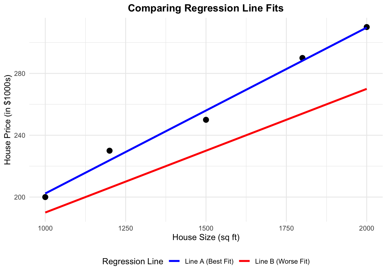
When using Ordinary Least Squares (OLS) to fit a regression line, our goal is to find the line that best represents the relationship between our dependent variable \(Y\) and independent variable \(X\). But what does “best” mean?
Imagine you have a scatter plot of data points. Now, consider drawing two different lines through this plot. Each one of these lines represent a set of predictions. They also represent a way to represent the relationship between the dependent variable \(Y\) and independent variable \(X\)
- Line A (Blue): A line that follows the general trend of the data very well.
- Line B (Red): A line that doesn’t capture the trend as accurately.
# Sample data
set.seed(42)
X <- c(1000, 1200, 1500, 1800, 2000)
Y <- c(200, 230, 250, 290, 310)

# Create a data frame
df <- data.frame(Size = X, Price = Y)

# Fit the correct OLS model
correct_model <- lm(Price ~ Size, data = df)

# Create predictions for the two lines
df$Predicted_Correct <- predict(correct_model, newdata = df)
df$Predicted_Wrong <- 110 + 0.08 * df$Size  # Adjusted manually

# Reshape data for ggplot (to add legend)
df_long <- data.frame(
  Size = rep(df$Size, 2),
  Price = c(df$Predicted_Correct, df$Predicted_Wrong),
  Line = rep(c("Line A (Best Fit)", "Line B (Worse Fit)"), each = nrow(df))
)

# Store the plot with a legend
library(ggplot2)
plot <- ggplot() +
  geom_point(data = df, aes(x = Size, y = Price), size = 3, color = "black") +
  geom_line(data = df_long, aes(x = Size, y = Price, color = Line), linewidth = 1.2) +
  scale_color_manual(values = c("Line A (Best Fit)" = "blue", "Line B (Worse Fit)" = "red")) +
  labs(title = "",
       x = "House Size (sq ft)",
       y = "House Price (in $1000s)",
       color = "Regression Line") +
  theme_minimal() +
  theme(plot.title = element_text(hjust = 0.5, face = "bold"),
        legend.position = "bottom")

plot
import numpy as np
import pandas as pd
import matplotlib.pyplot as plt
import statsmodels.api as sm
import statsmodels.stats.api as sms
# Sample data
np.random.seed(42)
X = np.array([1000, 1200, 1500, 1800, 2000])
Y = np.array([200, 230, 250, 290, 310])
df = pd.DataFrame({'Size': X, 'Price': Y})
# Fit the correct OLS model
X_sm = sm.add_constant(df['Size'])
model = sm.OLS(df['Price'], X_sm).fit()
df['Predicted_Correct'] = model.predict(X_sm)
# Manually add the incorrect line
df['Predicted_Wrong'] = 110 + 0.08 * df['Size']
# Reshape for plotting
df_long = pd.concat([
df[['Size', 'Predicted_Correct']].rename(columns={'Predicted_Correct': 'Price'}).assign(Line='Line A (Best Fit)'),
df[['Size', 'Predicted_Wrong']].rename(columns={'Predicted_Wrong': 'Price'}).assign(Line='Line B (Worse Fit)')
])
# Plot
fig, ax = plt.subplots(figsize=(6, 4))
ax.scatter(df['Size'], df['Price'], color='black', label='Actual Data')
for label, group in df_long.groupby('Line'):
ax.plot(group['Size'], group['Price'], label=label)
ax.set_xlabel("House Size (sq ft)")
ax.set_ylabel("House Price (in $1000s)")
ax.legend(title="Regression Line", loc='lower right')
plt.grid(True)
plt.show()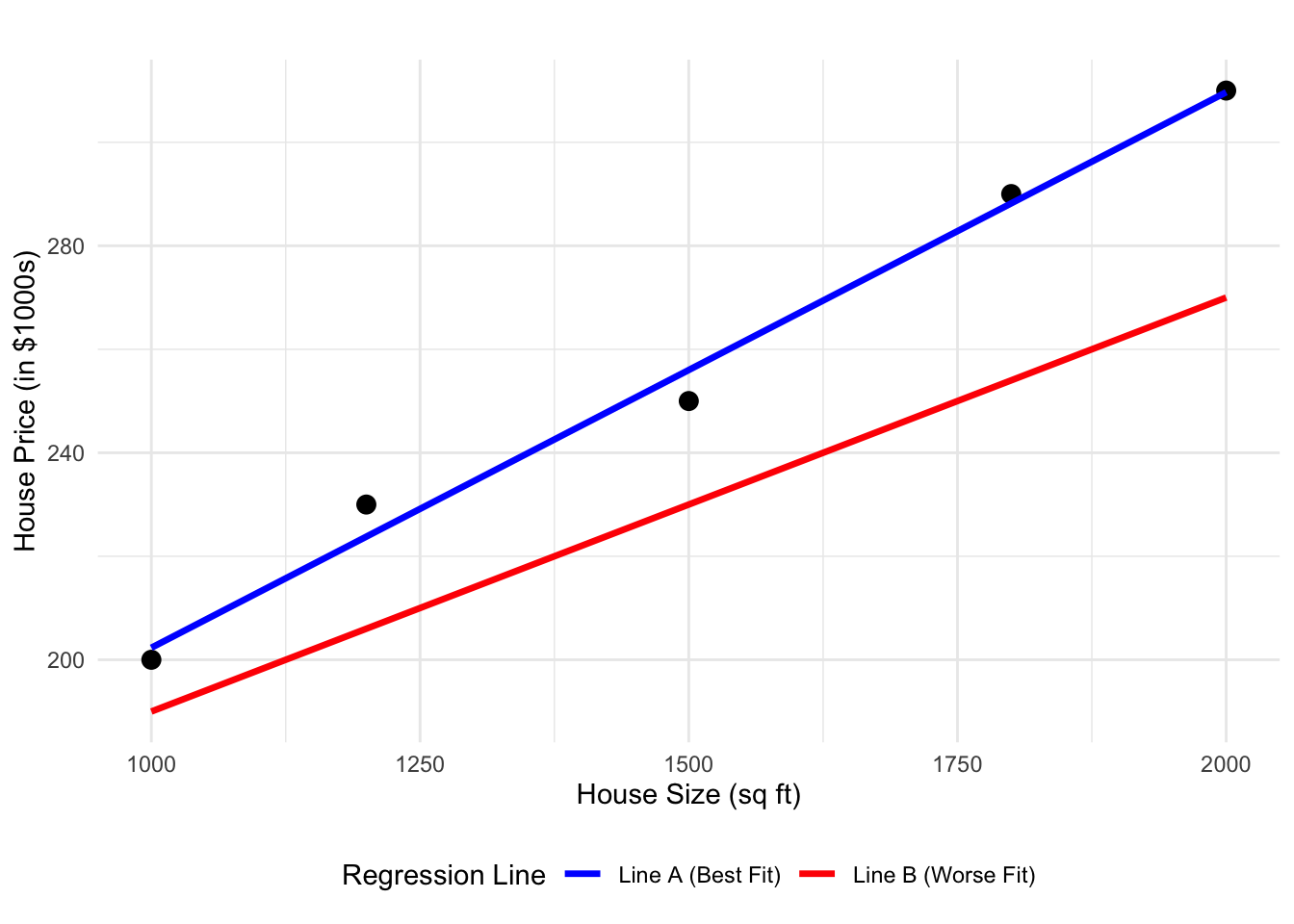
3.3.1 Understanding Residuals
For each data point, the residual is the vertical distance between the actual \(Y\) value and the predicted \(Y\) value (denoted \(\hat{Y}\)) on the line. In simple terms, it tells us how far off our prediction is for each point given the same \(X\) value. If a line fits well, these residuals will be small, meaning our predictions of the \(Y\) variable are close to the actual value.
OLS quantifies how well a line fits the data by calculating the Sum of Squared Errors (SSE). The SSE is obtained by:
- Computing the residual for each data point.
- Squaring each residual (this ensures that errors do not cancel each other out).
- Summing all these squared values.
\[ SSE=\sum_{i=1}^{n} (Y_i - \hat{Y}_i)^2 \]
A lower SSE indicates a line that is closer to the actual data points. OLS chooses the best line by finding the one with the smallest SSE.
3.3.2 Quantifying the Fit with SSE
We can compare the two lines by computing their SSE. The code below calculates and prints the SSE for each line:
# Calculate the Sum of Squared Errors for the correct model (Blue)
sse_correct <- sum((df$Price - df$Predicted_Correct)^2)

# Calculate the Sum of Squared Errors for the manually adjusted model (Red)
sse_wrong <- sum((df$Price - df$Predicted_Wrong)^2)

# Print the SSEs for each line
cat("SSE for Best-Fit Line (Blue line):", sse_correct, "\n")
cat("SSE for Worse-Fit Line (Red line):", sse_wrong, "\n")
# Calculate the Sum of Squared Errors for the correct model (Blue)
sse_correct = np.sum((df['Price'] - df['Predicted_Correct']) ** 2)
# Calculate the Sum of Squared Errors for the manually adjusted model (Red)
sse_wrong = np.sum((df['Price'] - df['Predicted_Wrong']) ** 2)
# Print the SSEs for each line
print(f"SSE for Best-Fit Line (Blue line): {sse_correct}")
print(f"SSE for Worse-Fit Line (Red line): {sse_wrong}")SSE for Best-Fit Line (Blue line): 83.23529 SSE for Worse-Fit Line (Red line): 3972 SSE for Best-Fit Line (Blue line): 83.23529411764703SSE for Worse-Fit Line (Red line): 3972.0When you run this code, you’ll observe that the blue line (Line A) has a much lower SSE compared to the red line (Line B). This tells us that the blue line is a better fit for the data because its predictions are, on average, closer to the actual values.
In summary, OLS selects the “best line” by minimizing the sum of squared errors, ensuring that the total error between predicted and actual values is as small as possible.
3.3.3 Why Squared Errors?
When measuring how far off our predictions are, errors can be positive (if our prediction is too low) or negative (if it’s too high). If we simply added these errors together, they could cancel each other out, hiding the true size of the mistakes. By squaring each error, we convert all numbers to positive values so that every mistake counts.
In addition, squaring makes big errors count a lot more than small ones. This means that a large mistake will have a much bigger impact on the overall error, encouraging the model to reduce those large errors and improve its overall accuracy.
3.3.4 The Mathematical Formulation of the OLS Model
Now that we understand how OLS finds the best-fitting line by minimizing the differences between the actual and predicted values, let’s look at the math behind it.
In a simple linear regression with one predictor, we express the relationship between the outcome \(Y\) and the predictor \(X\) using the following equation. Note that OLS fits a straight line to the data, which is why the equation takes the familiar form of a straight line:
\[ Y=\beta_0+\beta_1X+\epsilon \]
Here’s what each part of the equation means:
- \(Y\) is the dependent variable or the outcome we want to predict.
- \(X\) is the independent variable or the predictor that we believe influences \(Y\).
- \(\beta_0\) is the intercept. It represents the predicted value of \(Y\) when \(X=0\).
- \(\beta_1\) is the slope. It tells us how much \(Y\) is expected to change for each one-unit increase in \(X\).
- \(\epsilon\) is the error term. It captures the random variation in \(Y\) that cannot be explained by \(X\).
This equation provides a clear mathematical framework for understanding how changes in \(X\) are expected to affect \(Y\), while also accounting for random variation. In the upcoming section, we will explore our toy dataset to showcase this equation and OLS in action.
3.4 Case Study: Understanding Financial Behaviors
To demonstrate Ordinary Least Squares (OLS) in action, we will walk through a case study using a toy dataset. This case study will help us understand the financial behaviors of students and identify the factors that influence their Net_Money, the amount of money left over at the end of each month. We will approach this case study using the data science workflow described in a previous chapter, ensuring a structured approach to problem-solving and model building.
3.4.1 The Dataset
Our dataset captures various aspects of students’ financial lives. Each row represents a student, and the columns describe different characteristics. Table 3.1 provides the relevant details for the regressors in this dataset—namely, employment status, year of study, financial dependency, monthly allowance, cooking habits, living situation, housing type, spending frequency, alcohol consumption, and monthly earnings along with brief descriptions of each variable. Note that we also indicate the coding names of all the variables involved in the last column.
| Variable | Type | Scale | Model Role | Coding Name |
|---|---|---|---|---|
| Has Job (0 = No, 1 = Yes) | Discrete | Binary | Regressor | Has_Job |
| The student’s current year of study (e.g., 1st, 2nd, etc.) | Discrete | Ordinal | Regressor | Year_of_Study |
| Financially Dependent (0 = No, 1 = Yes) | Discrete | Binary | Regressor | Financially_Dependent |
| Monthly Allowance (CAD) | Continuous | Positively unbounded | Regressor | Monthly_Allowance |
| Cooks at Home (0 = No, 1 = Yes) | Discrete | Binary | Regressor | Cooks_at_Home |
| Living Situation (Family, Shared, Alone, etc.) | Discrete | Categorical | Regressor | Living_Situation |
| Housing Type (Rent, Own, Dormitory) | Discrete | Categorical | Regressor | Housing_Type |
| Goes Out & Spends Money (1 = Rarely, 5 = Very often) | Discrete | Ordinal | Regressor | Goes_Out_Spends_Money |
| Drinks Alcohol (0 = No, 1 = Yes) | Discrete | Binary | Regressor | Drinks_Alcohol |
| Net Money (CAD) | Continuous | Unbounded | Response | Net_Money |
| Monthly Earnings (CAD) | Continuous | Positively unbounded | Regressor | Monthly_Earnings |
Let us load this sample of \(n = 1,000\) houses in both R and Python. For Python, we will need the {pandas} library. Table 3.2 and Table 3.3 show the first 100 rows of this full dataset and R and Python, respectively.
# Showing the first 100 rows of toy dataset
head(data, n = 100)
# Showing the first 100 rows of toy dataset
print(data.head(100))This dataset provides a structured way to analyze the financial habits of students and determine which factors contribute most to their financial stability.
3.4.2 The Problem We’re Trying to Solve
Our goal in this case study is to understand which factors impact a student’s net money. Specifically, we aim to identify which characteristics, such as having a job, monthly earnings, or financial support, explain why some students have more money left over at the end of the month than others.
The key question we want to answer is:
Which factors have the biggest influence on a student’s net money?
By applying OLS to this dataset, we can:
- Measure how much each factor contributes to variations in net money. For example, we can determine the increase in net money associated with a one-unit increase in monthly earnings.
- Identify whether each factor has a positive or negative effect on net money.
- Understand the unique contribution of each variable while accounting for the influence of others. This helps us isolate the effect of, say, having a job from that of receiving financial support.
- Predict a student’s net money based on their characteristics. These insights could help institutions design targeted financial literacy programs or interventions to improve financial stability.
- Evaluate the overall performance of our model using statistical measures such as R-squared and p-values. This not only confirms the significance of our findings but also guides improvements in future analyses.
In summary, using OLS in this case study allows us to break down complex financial behaviors into understandable components. This powerful tool provides clear, actionable insights into which factors are most important, paving the way for more informed decisions and targeted interventions.
3.4.3 Study Design
Now that we’ve introduced our case study and dataset, it’s time to follow the data science workflow step by step. The first step is to define the main statistical inquiries we want to address. As mentioned earlier, our key question is:
Which factors have the biggest influence on a student’s net money?
To answer this question, we will adopt an inferential analysis approach rather than a predictive analysis approach. Let’s quickly review the difference between these two methods:
Inferential vs. Predictive Analysis
-
Inferential Analysis explores and quantifies the relationships between explanatory variables (e.g., student characteristics) and the response variable (
Net_Money). For example, we might ask: Does having a part-time job significantly affect a student’s net money, and by how much? The goal here is to understand these effects and assess their statistical significance. - Predictive Analysis focuses on accurately forecasting the response variable using new data. In this case, the question could be: Can we predict a student’s net money based on factors like monthly earnings, living situation, and spending habits? The emphasis is on building a model that produces reliable predictions, even if it doesn’t fully explain the underlying relationships.
3.4.4 Applying Study Design to Our Case Study
For our case study, we are interested in understanding how factors such as Has_Job, Monthly_Earnings, and Spending_Habits affect a student’s Net_Money. This leads us to adopt an inferential approach. We aim to answer questions like:
- Does having a part-time job lead to significantly higher net money?
- How much do a student’s monthly earnings influence their financial situation?
- Do spending habits, like going out frequently, decrease a student’s net money?
Using OLS, we will estimate the impact of each factor and determine whether these effects are statistically significant. This inferential analysis will help us understand which variables have the greatest influence on students’ financial outcomes.
If our goal were instead to predict a student’s future Net Money based on their characteristics, we would adopt a predictive approach. Although our focus here is on inference, it’s important to recognize that OLS is versatile and can be applied in both contexts.
3.5 Data Collection and Wrangling
With the statistical questions clearly defined, the next step is to ensure that the data is appropriately prepared for analysis. Although we already have the dataset, it is valuable to consider how this data could have been collected to better understand its context and potential limitations.
3.5.1 Data Collection
For a study like ours, data on students’ financial behaviors could have been collected through various methods:
- Surveys: Students might have been asked about their employment status, earnings, and spending habits through structured questionnaires. While surveys can capture self-reported financial behaviors, they may suffer from recall bias or social desirability bias.
- Administrative Data: Universities or employers may maintain records on student income and employment, providing a more objective source of financial information. However, access to such data may be limited due to privacy regulations.
- Financial Tracking Apps: Digital financial management tools can offer detailed, real-time data on student income and spending patterns. While these apps provide high granularity, they may introduce selection bias, as only students who use such apps would be represented in the dataset.
Regardless of the data collection method, each approach presents challenges, such as missing data, reporting errors, or sample biases. Addressing these issues is a critical aspect of data wrangling.
3.5.2 Data Wrangling
Now that our dataset is ready, the next step is to clean and organize it so that it’s in the best possible shape for analysis using OLS. Data wrangling involves several steps that ensure our data is accurate, consistent, and ready for modelling. Here are some key tasks:
Handling Missing Data
The first task is to ensure data integrity by checking for missing values. Missing data can occur for various reasons, such as unrecorded responses or errors in data entry. When we find missing values—for example, if some students don’t have recorded earnings or net money—we must decide how to handle these gaps. Common strategies include:
- Removing incomplete records: If the amount of missing data is minimal or missingness is random.
- Imputing missing values: Using logical estimates or averages if missingness follows a systematic pattern.
In our toy dataset, there are no missing values, as confirmed by:
# Count missing values in each column
data.isna().sum()
Has_Job 0
Year_of_Study 0
Financially_Dependent 0
Monthly_Allowance 0
Cooks_at_Home 0
Living_Situation 0
Housing_Type 0
Goes_Out_Spends_Money 0
Drinks_Alcohol 0
Net_Money 0
Monthly_Earnings 0
dtype: int64Encoding Categorical Variables
For regression analysis, we need to convert categorical variables into numerical representations. In R, binary variables like Has_Job and Drinks_Alcohol should be transformed into factors so that the model correctly interprets them as categorical data rather than continuous numbers. For example:
# Convert binary columns to categorical dtype
cols_to_convert = ["Has_Job", "Drinks_Alcohol", "Financially_Dependent", "Cooks_at_Home"]
data[cols_to_convert] = data[cols_to_convert].astype("category")
Detecting and Handling Outliers
Outliers in continuous variables like Monthly_Earnings and Net_Money can distort the regression analysis by skewing results. We use the Interquartile Range (IQR) method to identify these extreme values. Specifically, any observation falling below 1.5 times the IQR below the first quartile (Q1) or above 1.5 times the IQR above the third quartile (Q3) is flagged as an outlier. These outliers are then treated as missing values and removed:
# Using IQR method to filter out extreme values in continuous variables
remove_outliers <- function(x) {
  Q1 <- quantile(x, 0.25, na.rm = TRUE)
  Q3 <- quantile(x, 0.75, na.rm = TRUE)
  IQR <- Q3 - Q1
  x[x < (Q1 - 1.5 * IQR) | x > (Q3 + 1.5 * IQR)] <- NA
  return(x)
}

data <- data |>
  mutate(across(c(Monthly_Earnings, Net_Money), remove_outliers))

# Remove rows with newly introduced NAs due to outlier handling
data <- na.omit(data)
# Define the IQR outlier-removal function
def remove_outliers(series):
Q1 = series.quantile(0.25)
Q3 = series.quantile(0.75)
IQR = Q3 - Q1
return series.where((series >= Q1 - 1.5 * IQR) & (series <= Q3 + 1.5 * IQR))
# Apply to specific continuous columns
data["Monthly_Earnings"] = remove_outliers(data["Monthly_Earnings"])
data["Net_Money"] = remove_outliers(data["Net_Money"])
# Drop rows with any newly introduced NAs (from outliers)
data = data.dropna()Splitting the Data for Model Training
To ensure that our OLS model generalizes well to unseen data, we split the dataset into training and testing subsets. The training set is used to estimate the model parameters, and the testing set is used to evaluate the model’s performance. This split is typically done in an 80/20 ratio, as shown below:
# Splitting the dataset by row order: first 80% for training, last 20% for testing
n = len(data)
split_index = int(0.8 * n)
train_data = data.iloc[:split_index]
test_data = data.iloc[split_index:]
Although random sampling is generally preferred, since it helps ensure the training and testing sets are representative of the overall dataset, we deliberately split the data by row index here to produce consistent results across R and Python. This allows for reproducible comparisons between implementations in both languages.
By following these steps, checking for missing values, encoding categorical variables, handling outliers, and splitting the data, we ensure that our dataset is clean, well-organized, and ready for regression analysis using OLS.
It is important to note, however, that these are just a few of the many techniques available during the data wrangling stage. Depending on the dataset and the specific goals of your analysis, you might also consider additional strategies such as feature scaling, normalization, advanced feature engineering, handling duplicate records, or addressing imbalanced data. Each of these techniques comes with its own set of solutions, and the optimal approach will depend on the unique challenges and objectives of your case.
3.6 Exploratory Data Analysis (EDA)
Before diving into data modelling, it is crucial to develop a deep understanding of the relationships between variables in the dataset. This stage, known as Exploratory Data Analysis (EDA), helps us visualize and summarize the data, uncover patterns, detect anomalies, and test key assumptions that will inform our modelling decisions.
3.6.1 Classifying Variables
The first step in EDA is to classify variables according to their types. This classification guides the selection of appropriate visualization techniques and modelling strategies. In our toy dataset, we categorize variables as follows:
-
Net_Moneyserves as the response variable, representing a continuous outcome constrained by realistic income and expenses.
The regressors include a mix of binary, categorical, ordinal, and continuous variables.
- Binary variables, such as
Has_JobandDrinks_Alcohol, take on only two values and need to be encoded for modelling. - Categorical variables, like
Living_SituationandHousing_Type, represent qualitative distinctions between different student groups. - Some predictors, like
Year_of_StudyandGoes_Out_Spends_Money, follow an ordinal structure, meaning they have a meaningful ranking but no consistent numerical spacing. - Finally,
Monthly_AllowanceandMonthly_Earningsare continuous variables, requiring attention to their distributions and potential outliers.
By classifying variables correctly at the outset, we ensure that they are analyzed and interpreted appropriately throughout the modelling process.
3.6.2 Visualizing Variable Distributions
Once variables are classified, the next step is to explore their distributions. Understanding how variables are distributed is crucial for identifying potential issues such as skewness, outliers, or missing values. We employ different visualizations depending on the variable type:
Continuous Variables
We begin by examining continuous variables, which are best visualized using histograms and boxplots.
Histograms
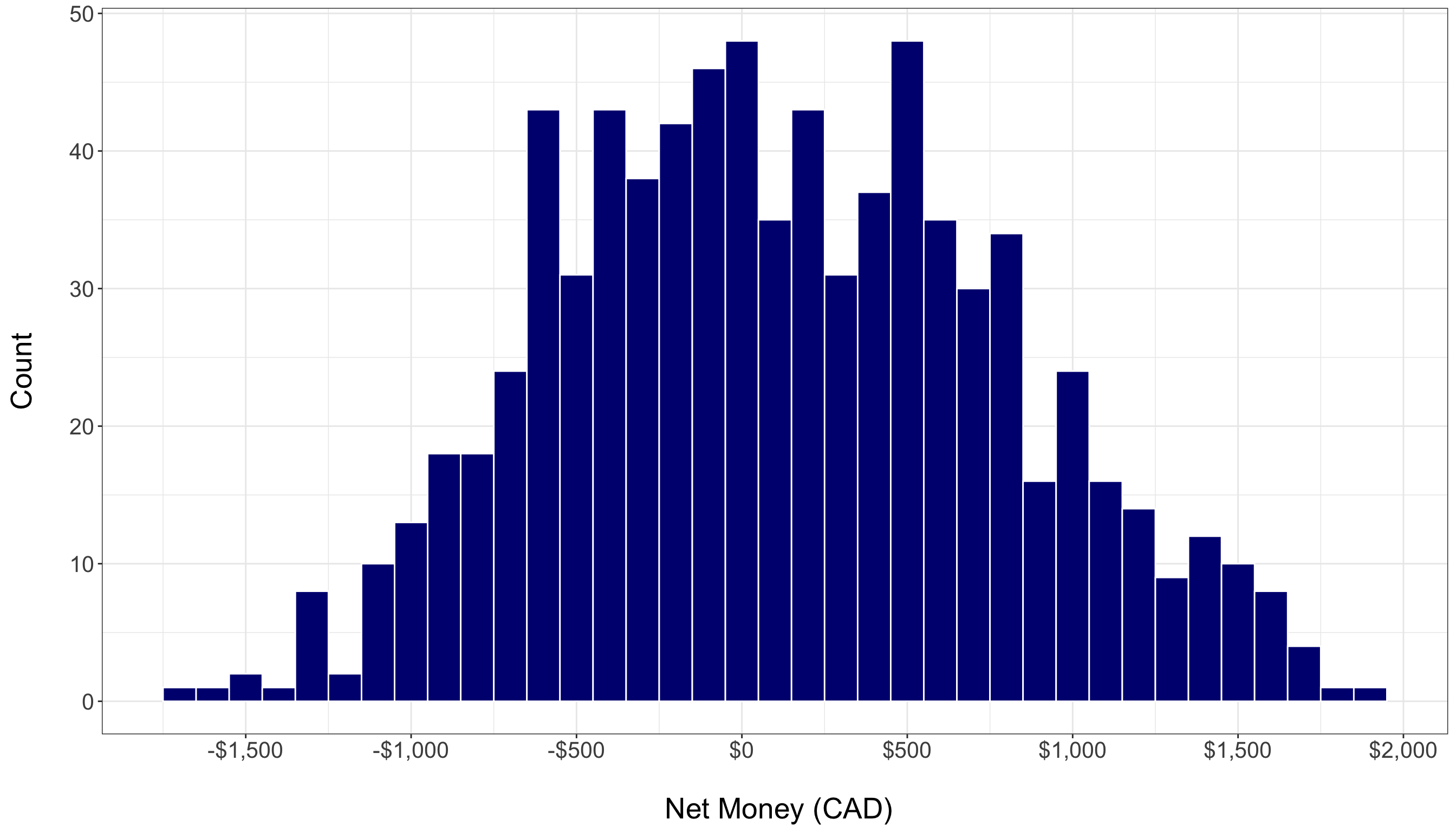
Histograms display the frequency distribution of a continuous variable. They allow us to assess the overall shape, central tendency, and spread of the data. For example, the histogram of Net_Money helps us determine if the variable follows a roughly normal distribution or if it is skewed. A normal distribution often appears bell-shaped, while skewness can indicate that the data might benefit from transformations (like logarithmic transformations) to meet the assumptions of regression analysis. In our case, the histogram below shows that Net_Money appears roughly normal.
Boxplots
Boxplots provide a concise summary of a variable’s distribution by displaying its quartiles and highlighting potential outliers. Outliers are typically defined as data points that fall below \(Q1 - 1.5 * IQR\) or above \(Q3 + 1.5 * IQR\). The boxplot below visualizesNet_Money and helps us quickly assess if there are any extreme values that might skew the analysis. In this case, the boxplot suggests that there are no significant outliers according to the IQR method (the method commonly used by ggplot to identify outliers).
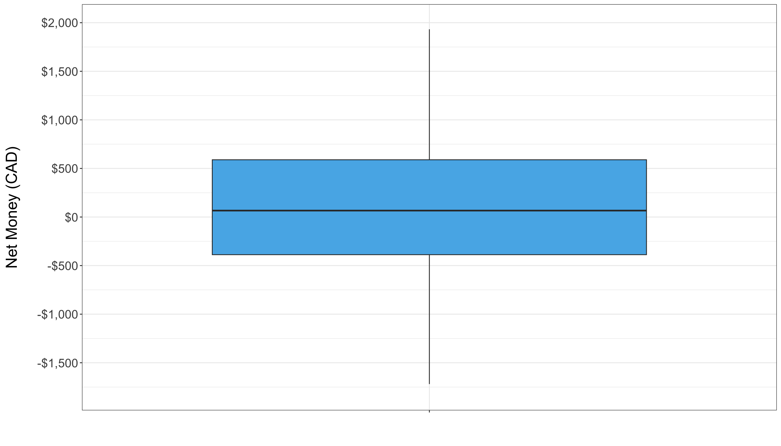
By visualizing the distribution of Net_Money with these plots, we gain valuable insights into its behavior. This understanding not only informs whether transformations are needed but also prepares us for deeper analysis as we move forward with regression modelling.
Categorical and Ordinal Variables
Categorical variables require a different approach from continuous ones because they represent distinct groups rather than numerical values. For these variables, bar charts are very effective. They display the frequency of each category, helping us understand the distribution of qualitative attributes.
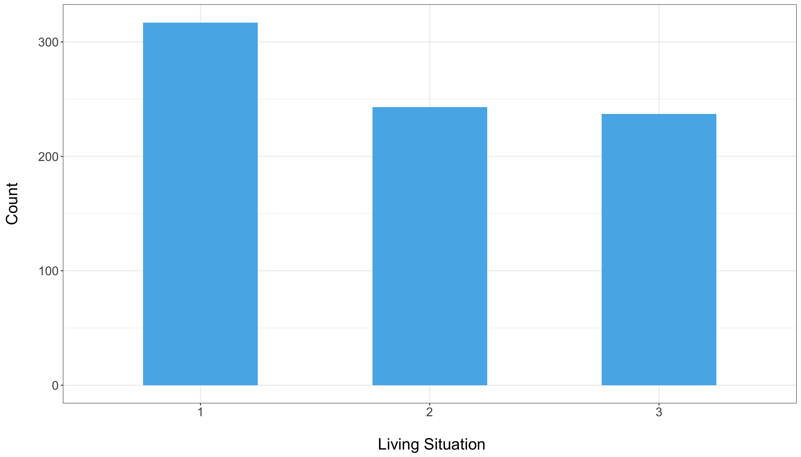
For example, consider the variable Living_Situation. The bar chart below shows how many students fall into each category. From the chart, we can see that category 1 is more heavily represented, while categories 2 and 3 have roughly similar counts. This insight can be critical—if a category is underrepresented, you might need to consider grouping it with similar categories or applying techniques such as one-hot encoding to ensure that each category contributes appropriately to the model.
For ordinal variables (which have a natural order but not a fixed numerical interval), you might still use bar charts to show the ranking or frequency of each level. Additionally, understanding these distributions can help you decide whether to treat them as categorical variables or convert them into numeric scores for analysis.
Exploring Relationships Between Variables
Beyond examining individual variables, it is crucial to explore how they interact with one another, especially the predictors and the response variable. Understanding these relationships helps identify which predictors might be influential in the model and whether any issues, like multicollinearity, could affect regression estimates.
Correlation Matrices
For continuous variables, correlation matrices provide a numerical summary of how strongly pairs of variables are related. High correlations between predictors might signal multicollinearity, which can distort model estimates. For demonstration, consider the correlation matrix computed for Net_Money, Monthly_Allowance, and Monthly_Earnings:
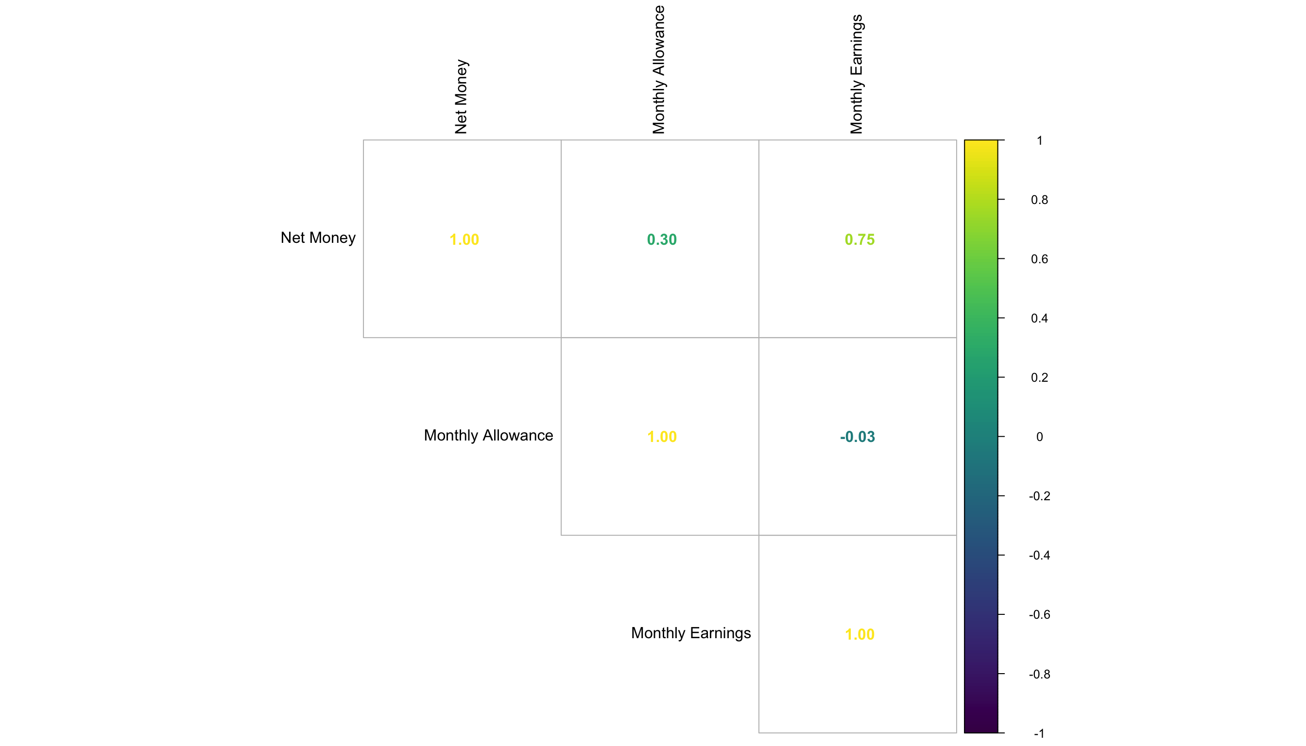
In the output, we observe a strong positive correlation (corr = 0.757) between Monthly_Earnings and Net_Money. This result is intuitive. Higher earnings typically lead to more money left at the end of the month, resulting in a higher Net_Money.
Scatterplots
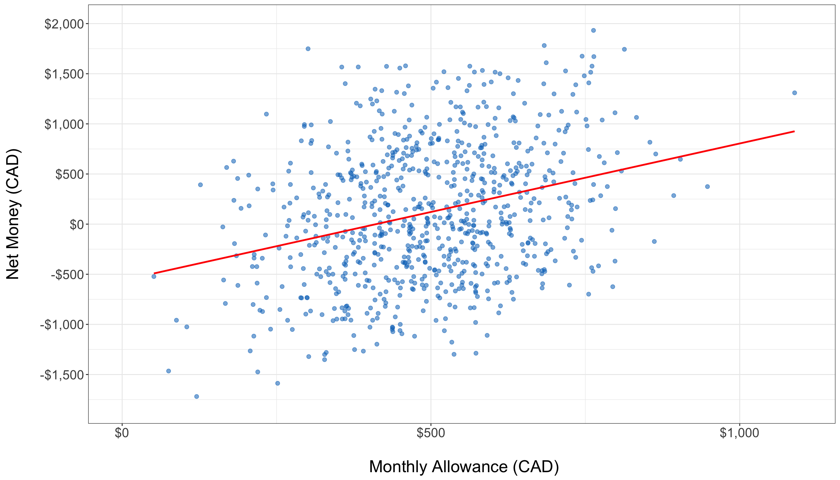
Scatter plots visually depict the relationship between two continuous variables. For example, plotting Monthly_Allowance against Net_Money helps us assess whether students with higher allowances tend to have higher or lower net savings. In the scatter plot below, a slightly positive trend is visible. However, the points are quite scattered, indicating that while there may be a relationship, it is not overwhelmingly strong. Such visual insights might prompt further investigation, perhaps considering polynomial transformations or interaction terms if nonlinearity is suspected.
Boxplots for Categorical Variables
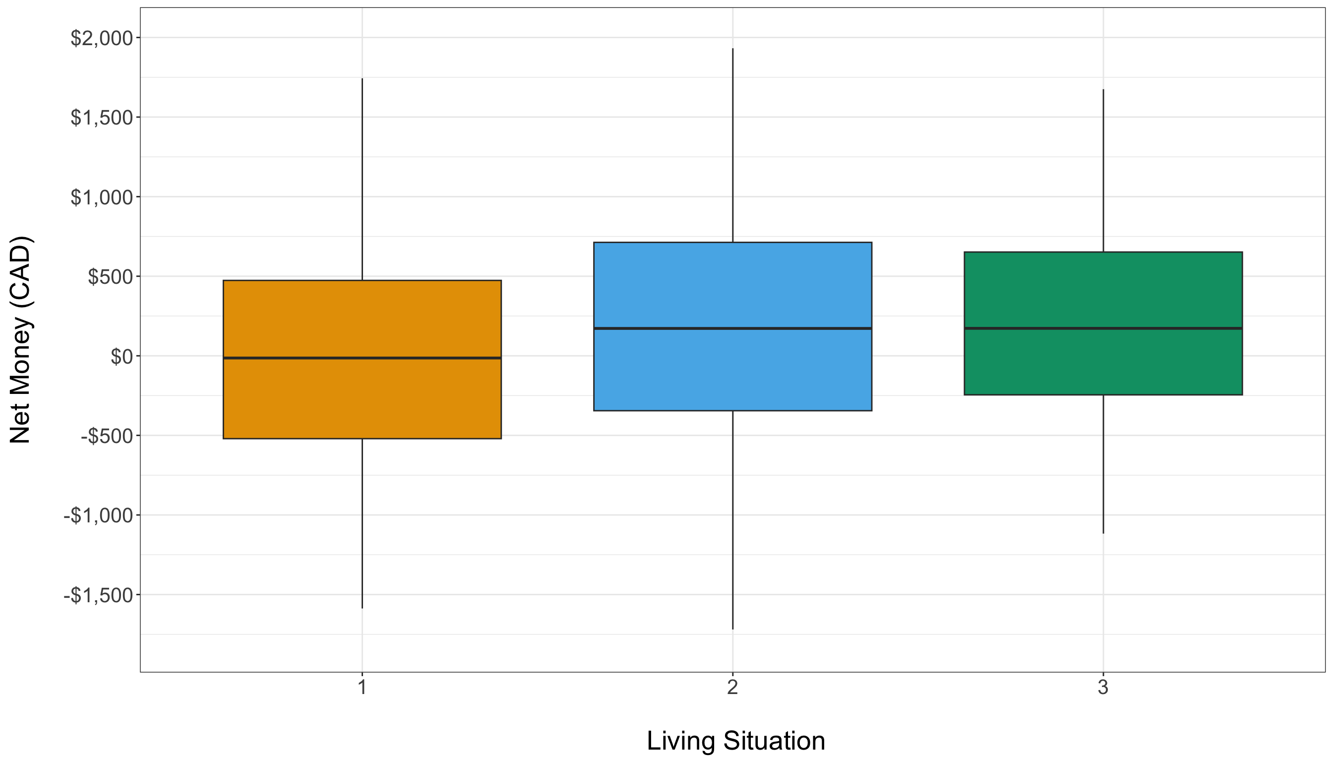
For categorical predictors, boxplots are an excellent tool to compare the distribution of the response variable across different groups. For instance, examining how Net_Money varies by Living_Situation can reveal whether students in different living arrangements experience different financial outcomes. In the boxplot below, the distributions of Net_Money across categories of Living_Situation appear quite similar. This similarity may suggest that Living_Situation has little impact on Net_Money in our dataset.
Summary Statistics
In addition to visual exploration, descriptive statistics provide a numerical summary of the dataset that is especially useful for beginners. Summary statistics give you a snapshot of the central tendency and spread of your data, helping you quickly grasp its overall characteristics.
For instance, if you notice that the mean of Monthly_Earning is significantly higher than its median, it might suggest that a few high values (or outliers) are skewing the data.
# Summary statistics for numerical variables
summary(train_data[, c("Net_Money", "Monthly_Allowance", "Monthly_Earnings")])
Net_Money Monthly_Allowance Monthly_Earnings
Min. :-1719.38 Min. : 51.33 Min. : 0.0
1st Qu.: -387.69 1st Qu.: 399.83 1st Qu.: 0.0
Median : 66.15 Median : 494.10 Median : 348.0
Mean : 117.76 Mean : 497.44 Mean : 500.5
3rd Qu.: 589.36 3rd Qu.: 592.96 3rd Qu.: 998.4
Max. : 1932.42 Max. :1088.94 Max. :1839.9 # Summary statistics for numerical variables
train_data[["Net_Money", "Monthly_Allowance", "Monthly_Earnings"]].describe()| Net_Money | Monthly_Allowance | Monthly_Earnings | |
|---|---|---|---|
| count | 797.000000 | 797.000000 | 797.000000 |
| mean | 117.758595 | 497.442424 | 500.451432 |
| std | 675.877166 | 147.209448 | 536.948133 |
| min | -1719.378062 | 51.329604 | 0.000000 |
| 25% | -387.687620 | 399.833067 | 0.000000 |
| 50% | 66.145622 | 494.103907 | 347.994676 |
| 75% | 589.360845 | 592.956717 | 998.419667 |
| max | 1932.416524 | 1088.935656 | 1839.947244 |
3.6.3 Key Takeaways from EDA
Conducting Exploratory Data Analysis (EDA) allows us to gain an initial understanding of the data and its underlying patterns before moving on to model building. Through EDA, we identify the types of variables present, examine their distributions, and uncover potential issues such as skewness, outliers, or multicollinearity. This process helps to highlight which variables might be strong predictors and which may require additional transformation or treatment. For instance, a strong correlation between two variables, like Monthly_Earnings and Net_Money, signals that earnings are likely a key driver of net savings. At the same time, observing differences in distributions or spotting similar patterns across groups in boxplots can inform us about the impact of categorical factors like Living_Situation.
It is important to remember that the insights gained from EDA are preliminary and primarily serve to inform further analysis. When we explore relationships between only two variables, we might overlook the influence of other factors, which could lead to misleading conclusions if taken in isolation. EDA is a crucial step for forming initial hypotheses and guiding decisions regarding data transformations, feature engineering, and the overall modelling strategy. With this foundation, we are better prepared to build a robust Ordinary Least Squares (OLS) regression model on data that has been carefully examined and understood.
3.7 Data Modelling
After conducting Exploratory Data Analysis (EDA), we transition to the modelling stage, where we apply a structured approach to uncover relationships between variables and predict outcomes. In this section, we focus on Ordinary Least Squares (OLS) regression, a widely used statistical technique for modelling linear relationships.
OLS aims to estimate the effect of multiple predictors on an outcome variable by minimizing the sum of squared differences between observed and predicted values. This approach helps quantify financial behaviors, allowing us to interpret the impact of various factors on students’ net financial balance.
3.7.1 Choosing a Suitable Regression Model
The choice of regression model depends on the patterns identified in EDA and the objectives of our analysis. Regression techniques vary in complexity, with some handling simple linear relationships and others accounting for more nuanced effects. Below are common approaches:
- Simple Linear Regression models the relationship between a single predictor and the response variable. This approach is suitable when we suspect a dominant factor driving financial balance.
- Multiple Linear Regression extends simple regression by incorporating multiple predictors, allowing us to account for various financial influences simultaneously.
- Polynomial Regression captures non-linear relationships by introducing polynomial terms of predictors, useful when relationships observed in scatter plots are curved rather than strictly linear.
- Log-Linear Models transform skewed distributions to improve interpretability and meet regression assumptions.
- Regularized Regression (Ridge and Lasso) applies penalties to regression coefficients to handle multicollinearity and enhance model generalization by reducing overfitting.
Given that our goal is to examine how multiple factors-such as income, expenses, and living arrangements—affect students’ financial balance, we select Multiple Linear Regression via OLS. This method allows us to quantify the influence of each predictor while controlling for confounding effects.
3.7.2 Defining modelling Parameters
Once we select OLS regression, we define the key modelling components: the response variable (dependent variable) and the predictor variables (independent variables).
Response Variable (Y):
The response variable, also known as the dependent variable, represents the financial outcome we aim to explain:
-
Net_Money: The dependent variable representing financial balance.
Predictor Variables (X):
Each predictor variable is chosen based on its theoretical and statistical relevance in explaining financial behavior:
-
Has_Job(Binary) – Indicates whether the student has a job (1 = Yes, 0 = No). -
Financially_Dependent(Binary) – Identifies students who rely on external financial support. -
Year_of_Study(Ordinal) – Represents academic seniority (higher values indicate later years). -
Goes_Out_Spends_Money(Ordinal) – Measures spending behavior on a scale from 1 to 6. -
Drinks_Alcohol(Binary) – Identifies whether a student consumes alcohol, which may impact discretionary spending. -
Monthly_Allowance(Continuous) – Represents financial support received from family or scholarships. -
Monthly_Earnings(Continuous) – Reflects the student’s personal income from work. -
Living_Situation(Categorical) – Encodes different living arrangements (e.g., dormitory, shared apartment, living with family). -
Housing_Type(Categorical) – Further distinguishes between different types of housing situations. -
Cooks_at_Home(Binary) – Indicates whether the student regularly prepares meals at home.
These predictors capture a mix of economic, behavioral, and lifestyle factors, providing a comprehensive view of the drivers of student financial balance.
3.7.3 Setting Up the modelling Equation
With all predictors defined, the OLS regression equation models the relationship between Net_Money and the predictor variables:
\[ \begin{align*} \text{Net\_Money} &= \beta_0 \\ &\quad + \beta_1 \times \text{Has\_Job} \\ &\quad + \beta_2 \times \text{Financially\_Dependent} \\ &\quad + \beta_3 \times \text{Year\_of\_Study} \\ &\quad + \beta_4 \times \text{Goes\_Out\_Spends\_Money} \\ &\quad + \beta_5 \times \text{Drinks\_Alcohol} \\ &\quad + \beta_6 \times \text{Monthly\_Allowance} \\ &\quad + \beta_7 \times \text{Monthly\_Earnings} \\ &\quad + \beta_8 \times \text{Living\_Situation} \\ &\quad + \beta_9 \times \text{Housing\_Type} \\ &\quad + \beta_{10} \times \text{Cooks\_at\_Home} \\ &\quad + \epsilon \end{align*} \]
where:
-
\(\beta_0\) represents the intercept, or the baseline
Net_Moneywhen all predictors are set to zero. - \(\beta_1, \beta_2, ..., \beta_{10}\) are the regression coefficients, quantifying the impact of each predictor on financial balance.
- \(\epsilon\) is the error term, accounting for unexplained variability and random noise.
Each coefficient provides insight into how Net_Money changes when a specific predictor increases by one unit, holding all other factors constant. For example:
-
\(\beta_5\) (
Drinks_Alcohol) measures the financial impact of alcohol consumption, which may reflect higher discretionary spending. -
\(\beta_6\) (
Monthly_Allowance) quantifies the increase in Net_Money per additional dollar of allowance. -
\(\beta_10\) (
Cooks_at_Home) indicates how much more (or less) financially stable students are when they cook at home instead of eating out.
If significant interaction effects exist—such as students who live independently having a different financial impact from increased earnings compared to those living with family—we can extend the model by adding interaction terms.
3.8 Estimation
With the data modelling stage completed, we now move to estimation, where we fit the Ordinary Least Squares (OLS) regression model to the data and obtain numerical estimates for the regression coefficients. These estimates quantify how much each predictor contributes to the response variable, allowing us to measure their individual effects on Net Money.
The goal of estimation is to determine the best-fitting regression line by minimizing the sum of squared residuals—the differences between the observed and predicted values. This step provides a mathematical basis for analyzing financial behaviors in students.
3.8.1 Fitting the Model
To estimate the regression coefficients, we fit the OLS model to the training data using Python (statsmodels) or R (lm). The model is trained using least squares estimation, which finds the coefficients that minimize the total squared error between observed values and predictions.
In R, we can fit the regression model using the lm() function:
# Load necessary library
library(stats)

# Fit the OLS model
ols_model <- lm(Net_Money ~ Has_Job + Financially_Dependent + Year_of_Study + Goes_Out_Spends_Money + Drinks_Alcohol + Monthly_Allowance + Monthly_Earnings + Living_Situation + Housing_Type + Cooks_at_Home, data = train_data)

# # Display summary of model results
# summary(ols_model)

# Displaying the tidy table
tidy(ols_model) |>
  mutate_if(is.numeric, round, 2)
# A tibble: 11 × 5
term estimate std.error statistic p.value
<chr> <dbl> <dbl> <dbl> <dbl>
1 (Intercept) -647. 48.0 -13.5 0
2 Has_Job1 91.2 39.6 2.31 0.02
3 Financially_Dependent1 -488. 15.9 -30.7 0
4 Year_of_Study -100. 6.94 -14.4 0
5 Goes_Out_Spends_Money -47.8 4.11 -11.6 0
6 Drinks_Alcohol1 -140. 16.1 -8.69 0
7 Monthly_Allowance 1.52 0.05 28.3 0
8 Monthly_Earnings 0.92 0.04 25.0 0
9 Living_Situation 108. 9.57 11.3 0
10 Housing_Type 57.8 9.9 5.84 0
11 Cooks_at_Home1 -86.4 16.2 -5.33 0 import statsmodels.formula.api as smf
# Fit the OLS model using a formula
ols_model = smf.ols(
formula="Net_Money ~ Has_Job + Financially_Dependent + Year_of_Study + Goes_Out_Spends_Money + Drinks_Alcohol + Monthly_Allowance + Monthly_Earnings + Living_Situation + Housing_Type + Cooks_at_Home",
data=train_data
).fit()
# Creating a tidy summary table
testing_OLS_tidy = pd.DataFrame({
"term": ols_model.params.index,
"estimate": np.round(ols_model.params.values, 2),
"std_error": np.round(ols_model.bse.values, 2),
"t_value": np.round(ols_model.tvalues.values, 2),
"p_value": np.round(ols_model.pvalues.values, 2)
})
# Displaying the tidy table
print(testing_OLS_tidy) term estimate std_error t_value p_value
0 Intercept -647.24 48.05 -13.47 0.00
1 Has_Job[T.1.0] 91.24 39.56 2.31 0.02
2 Financially_Dependent[T.1.0] -488.10 15.88 -30.74 0.00
3 Drinks_Alcohol[T.1.0] -139.96 16.10 -8.69 0.00
4 Cooks_at_Home[T.1.0] -86.39 16.22 -5.33 0.00
5 Year_of_Study -100.14 6.94 -14.43 0.00
6 Goes_Out_Spends_Money -47.85 4.11 -11.64 0.00
7 Monthly_Allowance 1.52 0.05 28.28 0.00
8 Monthly_Earnings 0.92 0.04 24.98 0.00
9 Living_Situation 107.92 9.57 11.27 0.00
10 Housing_Type 57.78 9.90 5.84 0.00# Display summary of model results
print(ols_model.summary()) OLS Regression Results
==============================================================================
Dep. Variable: Net_Money R-squared: 0.894
Model: OLS Adj. R-squared: 0.892
Method: Least Squares F-statistic: 661.0
Date: Sat, 18 Jul 2026 Prob (F-statistic): 0.00
Time: 12:18:07 Log-Likelihood: -5430.3
No. Observations: 797 AIC: 1.088e+04
Df Residuals: 786 BIC: 1.093e+04
Df Model: 10
Covariance Type: nonrobust
================================================================================================
coef std err t P>|t| [0.025 0.975]
------------------------------------------------------------------------------------------------
Intercept -647.2446 48.051 -13.470 0.000 -741.568 -552.921
Has_Job[T.1.0] 91.2444 39.558 2.307 0.021 13.592 168.897
Financially_Dependent[T.1.0] -488.1009 15.877 -30.742 0.000 -519.268 -456.934
Drinks_Alcohol[T.1.0] -139.9647 16.104 -8.691 0.000 -171.577 -108.353
Cooks_at_Home[T.1.0] -86.3903 16.221 -5.326 0.000 -118.231 -54.550
Year_of_Study -100.1425 6.941 -14.428 0.000 -113.768 -86.518
Goes_Out_Spends_Money -47.8537 4.110 -11.644 0.000 -55.921 -39.786
Monthly_Allowance 1.5162 0.054 28.283 0.000 1.411 1.621
Monthly_Earnings 0.9208 0.037 24.981 0.000 0.848 0.993
Living_Situation 107.9155 9.575 11.271 0.000 89.120 126.711
Housing_Type 57.7788 9.897 5.838 0.000 38.351 77.206
==============================================================================
Omnibus: 4.197 Durbin-Watson: 1.944
Prob(Omnibus): 0.123 Jarque-Bera (JB): 4.115
Skew: -0.138 Prob(JB): 0.128
Kurtosis: 3.218 Cond. No. 5.14e+03
==============================================================================
Notes:
[1] Standard Errors assume that the covariance matrix of the errors is correctly specified.
[2] The condition number is large, 5.14e+03. This might indicate that there are
strong multicollinearity or other numerical problems.3.8.2 Interpreting the Coefficients
After fitting the model, we examine the estimated coefficients to understand their impact. Each coefficient obtained from the OLS regression represents the expected change in Net_Money for a one-unit increase in the corresponding predictor, holding all other variables constant. The estimated regression equation can be expressed as:
\[ \begin{align*} \text{Net\_Money} &= -647.24 \\ &\quad + 91.24 \times \text{Has\_Job} \\ &\quad - 488.10 \times \text{Financially\_Dependent} \\ &\quad - 100.14 \times \text{Year\_of\_Study} \\ &\quad - 47.85 \times \text{Goes\_Out\_Spends\_Money} \\ &\quad - 139.96 \times \text{Drinks\_Alcohol} \\ &\quad + 1.52 \times \text{Monthly\_Allowance} \\ &\quad + 0.92 \times \text{Monthly\_Earnings} \\ &\quad + 107.92 \times \text{Living\_Situation} \\ &\quad + 57.78 \times \text{Housing\_Type} \\ &\quad - 86.39 \times \text{Cooks\_at\_Home} \\ &\quad + \epsilon \end{align*} \]
For example:
- The intercept (\(\beta_0 = -647.24\)) represents the expected financial balance for a student in the reference group—i.e., a student who has no job, is not financially dependent, does not go out to spend money or drink alcohol, receives no allowance or earnings, and is in the baseline category for all categorical variables.
- A 1 dollar increase in
Monthly_Allowance(\(\beta\) = 1.52$) is associated with a $1.52 increase inNet_Money, suggesting that students with larger allowances tend to have a higher financial balance, all else being equal.
These estimates provide an initial understanding of the direction and magnitude of relationships between predictors and financial balance. However, before drawing conclusions, we need to validate model assumptions and evaluate the statistical significance of each coefficient.
3.9 Goodness of Fit
After estimating the regression coefficients, the next step is to assess how well the model fits the data and whether it satisfies the assumptions of Ordinary Least Squares (OLS) regression. This evaluation ensures that the model is not only statistically valid but also generalizes well to unseen data. A well-fitting model should explain a substantial proportion of variation in the response variable while adhering to key statistical assumptions. If these assumptions are violated, model estimates may be biased, leading to misleading conclusions.
3.9.1 Checking Model Assumptions
OLS regression is built on several fundamental assumptions:
- linearity
- independence of errors
- homoscedasticity
- normality of residuals
If these assumptions hold, OLS provides unbiased, efficient, and consistent estimates. We assess each assumption through diagnostic plots and statistical tests.
Linearity
A core assumption of OLS is that the relationship between each predictor and the response variable is linear. If this assumption is violated, the model may systematically under- or overestimate Net_Money, leading to biased predictions. The Residuals vs. Fitted values plot is a common diagnostic tool for checking linearity. In a well-specified linear model, residuals should be randomly scattered around zero, without any discernible patterns. If the residuals exhibit a U-shaped or curved pattern, this suggests a non-linear relationship, indicating that transformations such as logarithmic, square root, or polynomial terms may be necessary.
To visualize linearity, we plot the residuals against the fitted values:
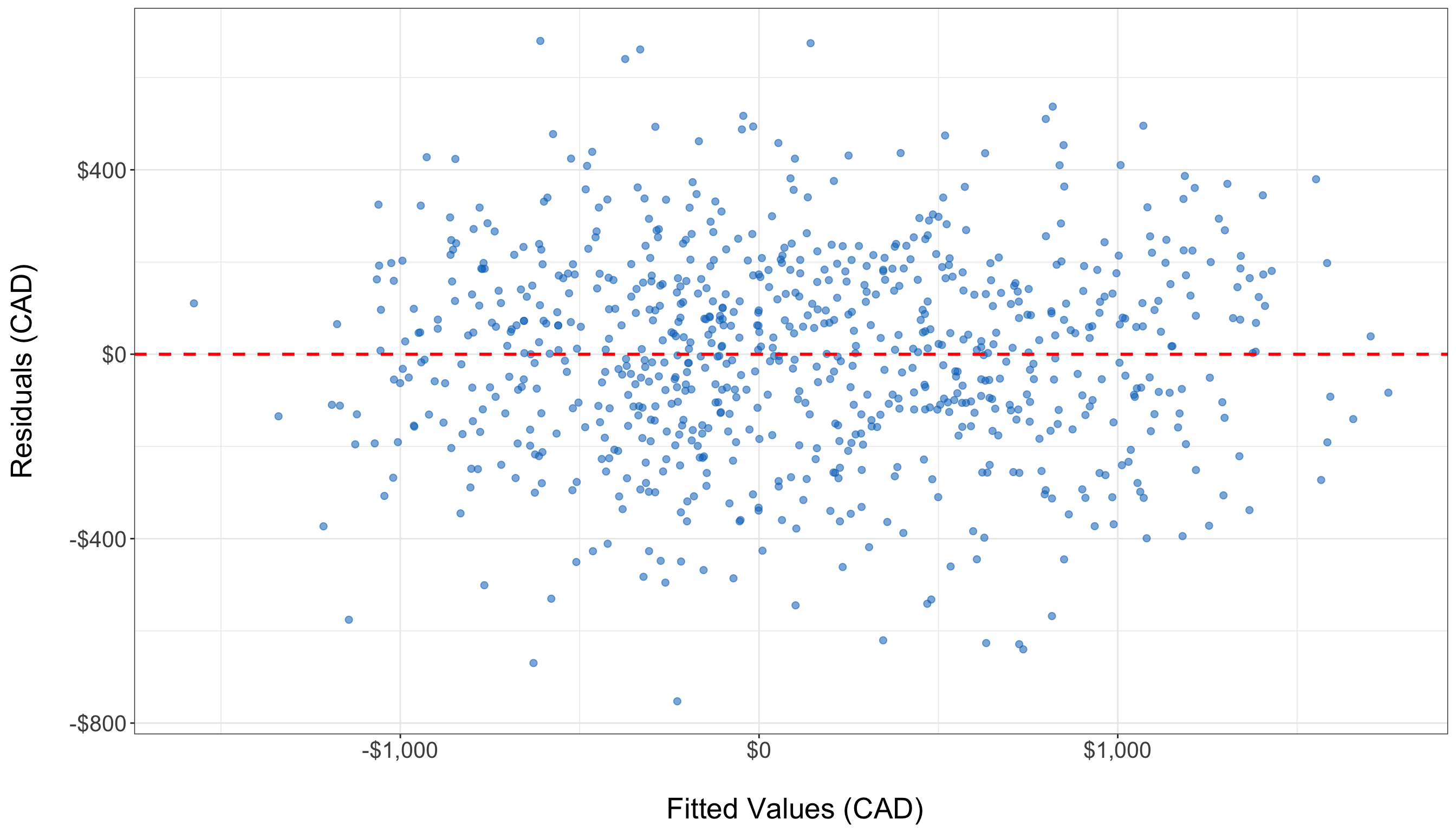
If the residual plot displays a clear trend, polynomial regression or feature engineering may be required to better capture the underlying data structure. However, in this case, the residuals appear to be randomly scattered around the horizontal axis, with no obvious patterns such as curves or systematic structure. This suggests that the linearity assumption of the OLS model holds reasonably well in this case. Therefore, no immediate transformation or addition of nonlinear terms is necessary to capture the relationship between predictors and the response variable.
Independence of Errors
The residuals, or errors, in an OLS model should be independent of one another. This assumption is particularly relevant in time-series or sequential data, where errors from one observation might influence subsequent observations, leading to autocorrelation. If the errors are correlated, the estimated standard errors will be biased, making hypothesis testing unreliable.
The Durbin-Watson test is commonly used to detect autocorrelation. This test produces a statistic that ranges between 0 and 4, where values close to 2 indicate no significant autocorrelation, while values near 0 or 4 suggest positive or negative correlation in the residuals.
dwtest(ols_model)
    Durbin-Watson test

data:  ols_model
DW = 1.9437, p-value = 0.2133
alternative hypothesis: true autocorrelation is greater than 0
from statsmodels.stats.stattools import durbin_watson
# Durbin-Watson test for autocorrelation of residuals
dw_stat = durbin_watson(ols_model.resid)
print(f"Durbin-Watson statistic: {dw_stat:.3f}")Durbin-Watson statistic: 1.944Based on the Durbin-Watson test, the test statistic is 1.9437 with a p-value of 0.2133. Since the statistic is close to 2 and the p-value is not statistically significant, we do not find evidence of autocorrelation in the residuals. This suggests that the assumption of independence of errors holds for this model.
If the test suggests autocorrelation, a possible solution is to use time-series regression models such as Autoregressive Integrated Moving Average (ARIMA) or introduce lagged predictors to account for dependencies in the data.
Homoscedasticity (Constant Variance of Errors)
OLS regression assumes that the variance of residuals remains constant across all fitted values. If this assumption is violated, the model exhibits heteroscedasticity, where the spread of residuals increases or decreases systematically. This can result in inefficient coefficient estimates, making some predictors appear statistically significant when they are not.
To check for heteroscedasticity, we plot residuals against the fitted values and conduct a Breusch-Pagan test, which formally tests whether residual variance is constant.
bptest(ols_model) # Uses all regressors, like Python
    studentized Breusch-Pagan test

data:  ols_model
BP = 14.381, df = 10, p-value = 0.1563
from statsmodels.stats.diagnostic import het_breuschpagan
# Extract residuals and design matrix from the fitted model
residuals = ols_model.resid
exog = ols_model.model.exog # independent variables (with intercept)
# Perform Breusch-Pagan test
bp_test = het_breuschpagan(residuals, exog)
# Unpack results
bp_stat, bp_pvalue, empty, empty = bp_test
print(f"Breusch-Pagan test statistic: {bp_stat:.3f}")Breusch-Pagan test statistic: 14.381print(f"P-value: {bp_pvalue:.4f}")P-value: 0.1563Since the p-value (0.1563) is greater than the conventional threshold of 0.05, we fail to reject the null hypothesis of constant variance. This indicates no significant evidence of heteroscedasticity, and thus the assumption of homoscedasticity appears to hold for this model.
If heteroscedasticity is detected, solutions include applying weighted least squares (WLS) regression, transforming the dependent variable (e.g., using a log transformation), or computing robust standard errors to correct for variance instability.
Normality of Residuals
For valid hypothesis testing and confidence interval estimation, OLS assumes that residuals follow a normal distribution. If residuals deviate significantly from normality, statistical inference may be unreliable, particularly for small sample sizes.
A Q-Q plot (Quantile-Quantile plot) is used to assess normality. If residuals are normally distributed, the points should lie along the reference line.
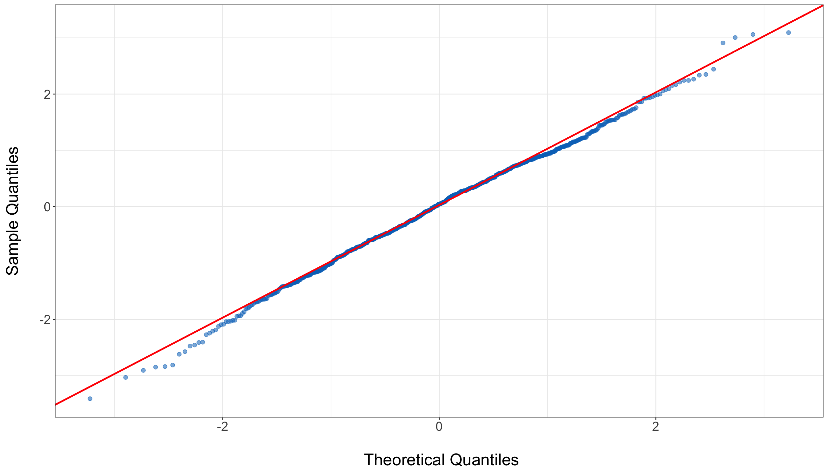
The Q-Q plot shows that the residuals closely follow the 45-degree reference line, indicating that the residuals are approximately normally distributed. While there are some mild deviations at the tails, these are minimal and do not suggest serious violations of the normality assumption.
If the plot reveals heavy tails or skewness, potential solutions include applying log or Box-Cox transformations to normalize the distribution. In cases where normality is severely violated, using a non-parametric model or bootstrapping confidence intervals may be appropriate.
3.9.2 Evaluating Model Fit
A good model should explain a large proportion of variance in the response variable.
R-Squared
Beyond checking assumptions, it is essential to assess how well the model explains variability in the response variable. One of the most commonly used metrics is R-Squared (\(R^2\)), which measures the proportion of variance in Net_Money that is explained by the predictors. An \(R^2\) value close to 1 indicates a strong model fit, whereas a low value suggests that important predictors may be missing or that the model is poorly specified.
We can retrieve the R-squared and Adjusted R-squared values from the model summary:
# R-squared
r_squared = ols_model.rsquared

# Adjusted R-squared
adj_r_squared = ols_model.rsquared_adj

# Print values
print(f"R-squared: {r_squared:.4f}")
R-squared: 0.8937print(f"Adjusted R-squared: {adj_r_squared:.4f}")Adjusted R-squared: 0.8924In this model, the R-squared is 0.894 and the adjusted R-squared is 0.892, indicating that around 89% of the variance in Net_Money is explained by the model.
However, while \(R^2\) provides insight into model fit, it has limitations. Adding more predictors will always increase \(R^2\), even if those predictors have little explanatory power. That’s why Adjusted R-squared is often preferred, as it adjusts for the number of predictors and only increases when a new variable meaningfully improves the model.
Finally, a high \(R^2\) should not be interpreted as evidence of causation, nor does it guarantee the model is free from issues like omitted variable bias or multicollinearity. Always complement goodness-of-fit metrics with residual diagnostics and statistical inference to ensure model reliability.
Identifying Outliers and Influential Points
Outliers and influential observations can distort regression estimates, making it crucial to detect and address them appropriately. One way to identify extreme residuals is through residual plots, where large deviations from zero may indicate problematic data points.
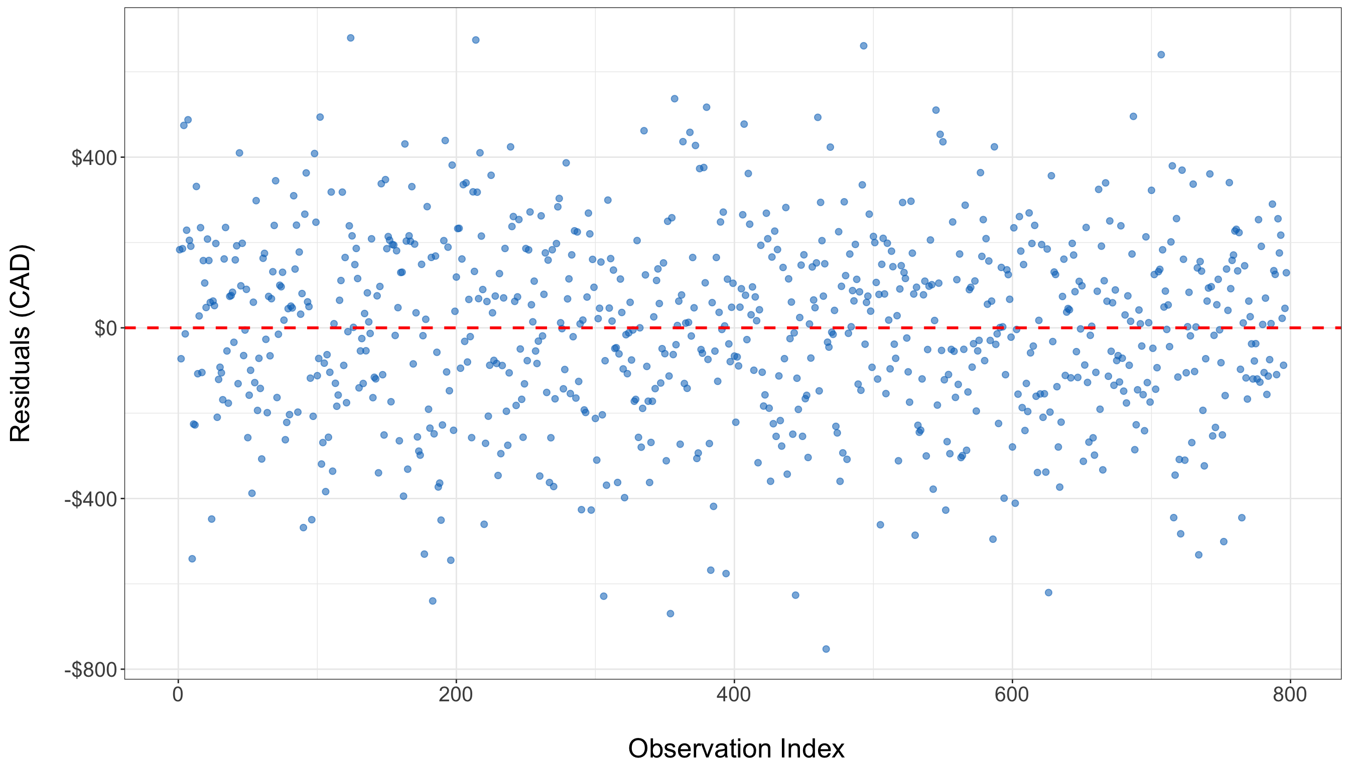
In the residual plot above, the residuals appear to be evenly and randomly scattered around zero, with no clear pattern or extreme values. This suggests that there are no obvious outliers or highly influential observations in the dataset. The model residuals behave as expected, reinforcing the assumption that the data points do not exert undue influence on the regression fit.
Another important diagnostic tool is Cook’s Distance, which measures the influence of each observation on the regression results. Data points with Cook’s Distance values greater than 0.5 may significantly impact model estimates.
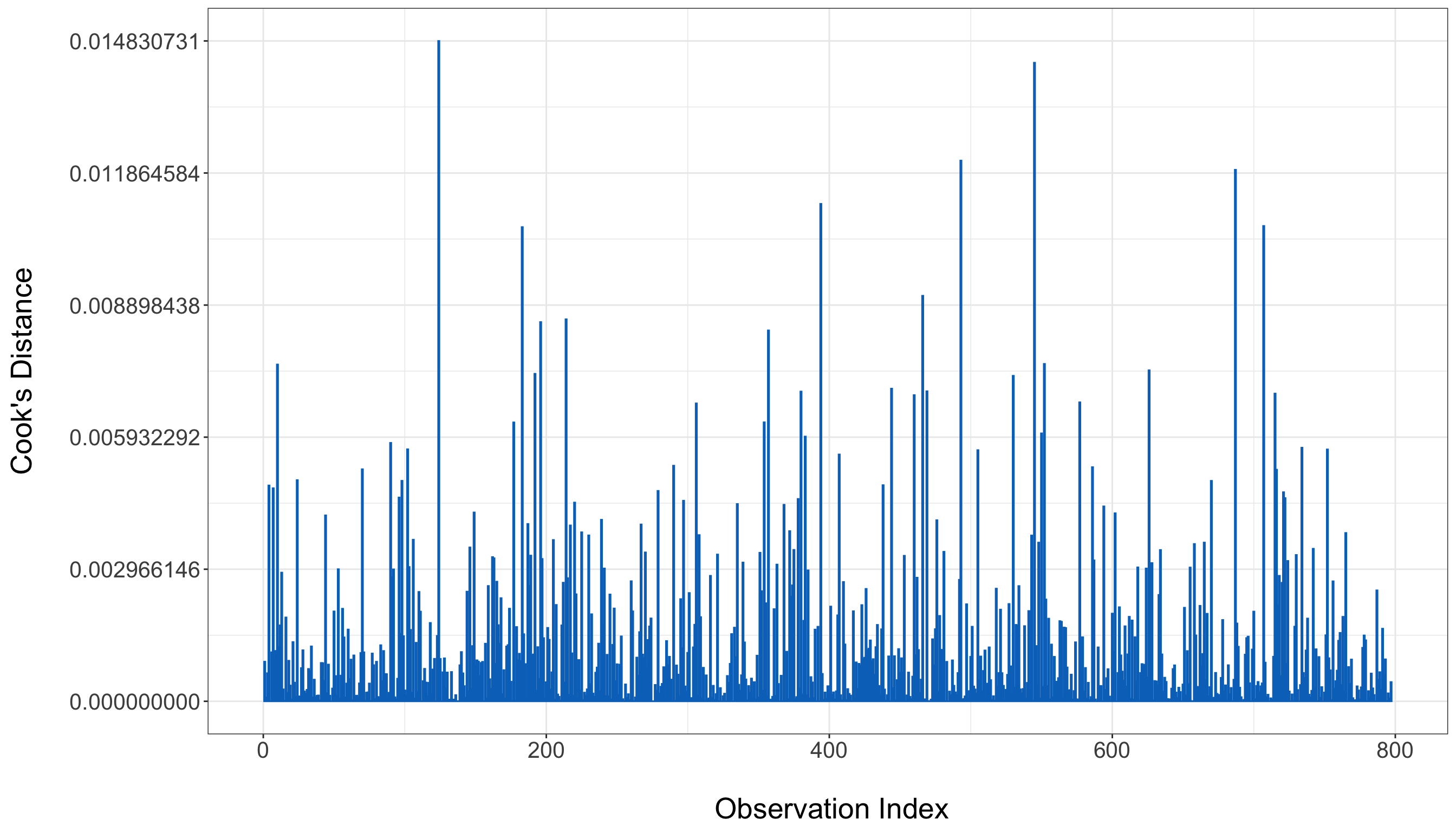
In the plot above, all observations have Cook’s Distance values well below the 0.5 threshold. This indicates that no individual data point has an undue influence on the model’s estimates.
If influential points are identified, the next steps involve investigating data quality, testing robust regression techniques, or applying Winsorization, which involves replacing extreme values with more moderate ones to reduce their impact.
3.10 Results
After validating the goodness of fit, we now assess how well the model performs in both predictive analysis and inferential analysis. This step involves using the trained model to generate predictions on unseen data and evaluating how well it generalizes beyond the training set. Additionally, we analyze the estimated regression coefficients to draw meaningful conclusions about student financial behaviors.
3.10.1 Predictive Analysis
A key objective of regression modelling is to generate reliable predictions. To assess how well our model generalizes, we apply it to the test dataset—a portion of the original data that was not used for model training. If the model’s predictions align closely with actual outcomes, we can conclude that it has strong predictive power.
In R, we use the predict() function to apply the trained OLS model to the test set. In Python, we use the predict() method from the statsmodels library after ensuring the test data is properly formatted.
# Generate predictions on the test set
y_pred <- predict(ols_model, newdata=test_data)
import statsmodels.api as sm
# Prepare the test data: add constant term to match training
X_test = test_data[[
"Has_Job", "Financially_Dependent", "Year_of_Study",
"Goes_Out_Spends_Money", "Drinks_Alcohol", "Monthly_Allowance",
"Monthly_Earnings", "Living_Situation", "Housing_Type", "Cooks_at_Home"
]]
X_test = sm.add_constant(X_test) # Add intercept term
# Generate predictions
y_pred = ols_model.predict(X_test)Once predictions are generated, we evaluate their accuracy using common regression error metrics.
Performance Metrics
Model accuracy is assessed using four standard error metrics:
- Mean Absolute Error (MAE) measures the average absolute differences between predicted and actual values. A lower MAE indicates better model accuracy.
- Mean Squared Error (MSE) calculates the average squared differences between predicted and actual values, penalizing larger errors more heavily.
- Root Mean Squared Error (RMSE) is the square root of MSE, making it easier to interpret since it retains the same units as the dependent variable (Net_Money).
- R-squared (\(R^2\)) quantifies the proportion of variance in Net_Money explained by the model. A higher \(R^2\) value indicates better model performance.
These metrics can be computed as follows:
# Extract response variable from test data
y_test <- test_data$Net_Money

# Calculate metrics in R
mae <- mean(abs(y_test - y_pred))
mse <- mean((y_test - y_pred)^2)
rmse <- sqrt(mse)
r2 <- summary(ols_model)$r.squared

cat(sprintf("MAE: %.2f, MSE: %.2f, RMSE: %.2f, R-squared: %.2f", mae, mse, rmse, r2))
MAE: 175.48, MSE: 45299.10, RMSE: 212.84, R-squared: 0.89from sklearn.metrics import mean_absolute_error, mean_squared_error, r2_score
import numpy as np
# Extract the true values
y_test = test_data["Net_Money"]
# Calculate metrics
mae = mean_absolute_error(y_test, y_pred)
mse = mean_squared_error(y_test, y_pred)
rmse = np.sqrt(mse)
r2 = r2_score(y_test, y_pred)
# Print results
print(f"MAE: {mae:.2f}, MSE: {mse:.2f}, RMSE: {rmse:.2f}, R-squared: {r2:.2f}")MAE: 175.48, MSE: 45299.10, RMSE: 212.84, R-squared: 0.91If the RMSE is significantly larger than the MAE, it suggests that the model is highly sensitive to large prediction errors, meaning that certain extreme values are having a disproportionate impact on the model’s performance. Similarly, a low R-squared value may indicate that important predictors are missing from the model or that the relationship is more complex than a simple linear pattern can capture.
In this case, the model’s performance metrics are encouraging. With a MAE of 175.48, the model’s predictions deviate from actual values by about $175 on average. The RMSE of 212.84, which is not drastically higher than the MAE, suggests that large errors are present but not excessively dominant. An R-squared value of 0.89 confirms that the model explains a substantial portion of the variance in Net_Money, indicating strong predictive performance and a solid overall model fit.
3.10.2 Inferential Analysis
Beyond prediction, OLS regression allows us to interpret the estimated coefficients to uncover patterns in students’ financial behaviors. Each coefficient represents the expected change in Net_Money for a one-unit increase in the corresponding predictor, assuming all other variables remain constant.
Insights from Regression Coefficients
Here are a few insights that we can extract from the regression model result:
- Financial dependency is one of the strongest negative predictors of financial balance. Students who rely on others—such as parents or guardians—for financial support tend to have $488.10 less in
Net_Money. This may be due to having limited personal income, reduced autonomy in managing expenses, or tighter financial constraints imposed by dependency on external sources. - Spending habits, particularly related to social activities, also play a crucial role. Students who report going out and spending money more frequently experience a $47.85 decrease in
Net_Moneyfor each unit increase in this behavior. This result aligns with expectations: frequent socializing often involves discretionary expenses such as dining out or entertainment, which can erode savings or disposable income over time. - Another lifestyle factor, alcohol consumption, is associated with a $139.96 drop in
Net_Money. This relatively large effect suggests that students who drink alcohol regularly may also engage in broader spending behaviors linked to nightlife or entertainment, significantly impacting their overall financial standing. It also highlights alcohol as a strong proxy for costly social habits. - Finally, the student’s living situation is associated with financial advantage. Certain types of living arrangements correspond to an increase of $107.92 in
Net_Money. This may reflect the financial benefits of shared housing, university-subsidized residences, or lower-cost arrangements. Choosing a cost-effective living setup appears to have a notable influence on students’ financial outcomes.
These findings suggest that students can improve their financial position through a combination of employment, controlled social spending, and strategic housing choices. Conversely, financial dependency and certain lifestyle habits like frequent alcohol use and going out may contribute to lower net balances. These insights can inform both personal budgeting decisions and institutional support strategies for student financial wellness.
3.11 Storytelling
The final step in our data science workflow is storytelling, where we translate our analytical findings into actionable insights. This stage ensures that our results are clearly understood by both technical and non-technical audiences. Effective storytelling involves summarizing insights, using visuals for clarity, and making data-driven recommendations.
3.12 Practice Problems
In this final section, you can test your understanding with the following conceptual interactive exercises, and then proceed to work through an inferential analysis of a simple dataset.
3.12.1 Conceptual Questions
Question 3.1
Multiple Choice
Suppose you fit a linear regression by OLS on the conditioned response \(Y_i \mid \mathbf{x}\) with \(k\) features in vector \(\mathbf{x} = (x_1, \dots, x_k)^\top\). Under which distributional assumption on the conditioned response is OLS estimation equivalent to MLE for the parameter vector \(\boldsymbol{\beta} = (\beta_0, \beta_1, \dots, \beta_k)^\top\)? Select the correct option:
A. \(Y_i \mid \mathbf{x}_i\) is a Normal random variable with mean \(\mu_i = \beta_0 + \beta_1 x_{1, i} + \dots \beta_k x_{k,i}\) and constant variance with mean \(\sigma^2\).
B. \(Y_i \mid \mathbf{x}_i\) is a Poisson random variable with mean \(\lambda_i = \exp \left( \beta_0 + \beta_1 x_{1, i} + \dots \beta_k x_{k,i} \right)\).
C. \(Y_i \mid \mathbf{x}_i\) is a Bernoulli random variable with probability of success \(\pi_i = \text{logit}^{-1}(\eta_i)\) with \(\eta_i = \beta_0 + \beta_1 x_{1, i} + \dots \beta_k x_{k,i}\).
D. We do not need any distributional assumption to set up such equivalence.
Answer 3.1
Click here to reveal the answer!
Correct answer: A.
Rationale:
OLS estimation can be equivalent to maximizing a Normal likelihood when
\[ Y_i \mid \mathbf{x}_i \sim \mathcal{N}(\mu_i, \sigma^2) \]
since the response is assumed to be continuous and unbounded. On the other hand, the Poisson and Binomial assumptions are suitable for count and binary responses, respectively. Also, their corresponding MLE processes are not related to minimizing the squared error as in OLS.
Question 3.2
Multiple Choice
What is the most appropriate interpretation of the regression coefficient \(\beta_1\) in the simple OLS linear regression model
\[\mathbb{E}[Y \mid x] = \beta_0 + \beta_1 x\]
for a continuous \(x\)? Select the correct option:
A. The average of the response \(Y\).
B. The change in the respose \(Y\) when the regressor \(x\) increases by 1, holding everything else fixed.
C. The change in the conditional mean of response \(Y\) for a one-unit increase in \(x\).
D. The probability that the response \(Y\) increases when the regressor \(X\) increases.
Answer 3.2
Click here to reveal the answer!
Correct answer: C.
Rationale:
The regression coefficient \(\beta_1\) is a statement about the conditional mean relationship \(\mathbb{E}[Y \mid x]\), not about individual outcomes or probabilities. Option B is close, but can be misleading because it sounds deterministic (i.e., “change in \(Y\)”), whereas the regression model implies randomness around the conditioned mean. Option A is wrong (a regression coefficient is not “the average”), and option D confuses the OLS regression interpretation with a probability statement.
Question 3.3
Open-ended Question
In two to four sentences, write a full interpretation of an estimated slope \(\hat{\beta}_1 = 2.3\) in a OLS model predicting exam score from hours studied, including the word “average” and the phrase “holding other variables fixed” (even if there are no other variables!).
Answer 3.3
Click here to reveal the answer!
Answer:
A correct and full interpretation is:
“In this OLS model, a one-hour increase in study time is associated with an average increase of about 2.3 points in expected exam score, holding other variables fixed. Individual students may score higher or lower than this average due to unexplained variability captured by the error term.”
Question 3.4
Multiple Choice
In OLS regression, the \(i\)th fitted response value \(\hat{y}_i\) is best described as:
A. The observed response value \(y_i\) with noise removed.
B. The model’s estimate of \(\mathbb{E} \left( Y_i \mid \mathbf{x}_i \right)\) with \(k\) explanatory variables in vector \(\mathbf{x} = (x_1, \dots, x_k)^\top\).
C. The model’s estimate of \(P(Y_i = 1 \mid \mathbf{x}_i)\).
D. The error term \(\varepsilon_i\).
Answer 3.4
Click here to reveal the answer!
Correct answer: B.
Rationale:
In OLS regression, \(\hat{y}_i\) approximates the conditional mean of \(Y\) given \(k\) explanatory variables, i.e., the systematic component. It is not the observed value “denoised” (option A indicates this), it is not a probability since OLS aims to predict continuous responses not discrete ones via probabilities (i.e., option C), and it is not the error term (D) since \(\varepsilon_i\) is a random variable.
Question 3.5
Short Answer
Why does OLS minimize the sum of squared residuals instead of just the sum of residuals? What problem would arise if we used absolute errors?
Answer 3.5
Click here to reveal the answer!
Rationale:
Squaring residuals ensures that positive and negative errors do not cancel out, while also placing greater weight on larger deviations. Using absolute errors would avoid cancellation, but introduces non-differentiability, which makes optimization more difficult compared to the smooth quadratic loss used in OLS.
Question 3.6
Short Answer
In the house price example (Figure 3.1), if Line A has an SSE of 83 and Line B has an SSE of 3972, which line would OLS choose? Why?
Answer 3.6
Click here to reveal the answer!
Rationale:
Line A, as lower SSE implies a better fit. OLS minimizes SSE.
Question 3.7
Short Answer
Could a regression line ever have an SSE of zero? What would that imply about the data?
Answer 3.7
Click here to reveal the answer!
Rationale:
Yes, if all points lie exactly on the line. This would indicate a perfect fit with no noise, which is highly unlikely with real data.
Question 3.8
Short Answer
In the student finance dataset, EDA reveals a strong correlation between Monthly_Earnings and Net_Money. Can we conclude that large monthly earnings lead to the students have greater net money?
Answer 3.8
Click here to reveal the answer!
Rationale:
No, since Correlation \(\neq\) causation. Omitted variables may link earnings to savings.
Question 3.9
Short Answer
If a histogram of Net_Money showed extreme right skewness, how could this violate OLS assumptions? What transformation could be done to address this?
Answer 3.9
Click here to reveal the answer!
Rationale:
Right skew violates normality, a log transformation could help resolve this.
Question 3.10
Short Answer
Why did we convert binary variables (such as Has_Job) to factors in R? What could happen if they were left as numeric 1s and 0s?
Answer 3.10
Click here to reveal the answer!
Rationale:
Factors ensure correct interpretation as categories (not continuous variables). Numeric 0/1 could work but increases risks of misspecification.
Question 3.11
Short Answer
The regression equation includes Living_Situation as a categorical predictor. How would the coefficient for Living_Situation=2 be interpreted compared to the baseline category?
Answer 3.11
Click here to reveal the answer!
Rationale:
Compared to baseline, Living_Situation=2 predicts $107.92 higher Net_Money, holding other variables constant.
Question 3.12
Short Answer
The coefficient for Drinks_Alcohol is −$139.96. How would you explain this in simple terms to a university administrator advocating for alcohol-free campuses?
Answer 3.12
Click here to reveal the answer!
Rationale:
We could say something along the lines of: “Students who drink alcohol average $140 fewer savings. Policies reducing drinking may improve students’ financial well-being.”
Question 3.13
Short Answer
If Monthly_Allowance had been measured in hundreds of dollars (6.58 instead of 658.99), how would the coefficient of Monthly_Allowance change?
Answer 3.13
Click here to reveal the answer!
Rationale:
The coefficient simply scales from 1.52 to 152.
Question 3.14
Short Answer
The Breusch-Pagan test for heteroscedasticity returns a p-value of 0.16. What does this imply about the residuals?
Answer 3.14
Click here to reveal the answer!
Rationale:
p > 0.05 implies no heteroscedasticity.
Question 3.15
Short Answer
In the Q-Q p plot shown in 3.9.1, if the residuals deviated sharply from the red line at the tails, what would this suggest? How might you address it?
Answer 3.15
Click here to reveal the answer!
Rationale:
This would suggest non-normally distributed tails. You could consider transformations (such as logging) or robust regression techniques.
Question 3.16
Short Answer
The model’s \(R^2\) is 0.89. What might a high \(R^2\) indicate? Is a higher \(R^2\) always better?
Answer 3.16
Click here to reveal the answer!
Rationale:
A high \(R^2\) may hide overfitting or omitted variables. It is important to also check residuals for the full picture.
Question 3.17
Short Answer
The coefficient for Financially_Dependent is −$488.10. Propose a few real-world mechanisms that could explain this relationship.
Answer 3.17
Click here to reveal the answer!
Rationale:
- Dependent students earn less; (2) Dependents may have stricter budgets
Question 3.18
Short Answer
If you suspected that the effect of Monthly_Earnings on Net_Money differs for students who Cook_at_Home, how would you modify the regression equation?
Answer 3.18
Click here to reveal the answer!
Rationale:
Add a term: Monthly_Earnings * Cooks_at_Home. This would allow slope differences.
Question 3.19
Short Answer
The dataset lacks variables like “student debt” or “scholarships.” How might this lead to omitted variable bias?
Answer 3.19
Click here to reveal the answer!
Rationale:
Missing debt/scholarships could bias the coefficients (for instance overstating job impact).
3.12.2 Coding Question
Problem 1
In this problem, you will investigate a dataset of surveyed students taking a programming course with a final exam at the end. Each student in this dataset was asked for their current grade out of 100, how many previous programming courses they took, how many hours they spent studying for the final, and how much they scored on the final exam out of 30, all stored as variables current_grade, prior_courses, hours_studied and exam_score respectively. Below is a full breakdown of the variables:
| Variable Name | Description |
|---|---|
| current_grade | The current average of the student in the course. Float from 0 to 100 (e.g. 87.9, 50.18, etc.). |
| prior_courses | The number of prior courses the student took. Integer (e.g. 0, 4, etc.). |
| hours_studied | The number of hours that the student spent studying for the final exam. Float (e.g. 10.7, 3.4, etc.). |
| exam_score | The score that the student received on their final exam. Float from 0 to 30 (e.g. 27.5, 29.1, etc.). |
For future iterations of the course, you are curious to know if it is possible to understand how well a student will do on the final given these three factors.
To answer this, the questions below will guide you through an OLS analysis on this data. Specifically, by the end of these questions, you will be able to answer the following concrete questions: 1. How does a 5% increase in a particular variable (one of current_grade, prior_courses, hours_studied) affect the exam_score? 2. Inference: How does hours_studied infulence exam_score, holding other variables constant? 3. Prediction: Given a particular set of predictor values, what is the expected exam_score? Dive in to see how you can answer these questions using OLS regression!
A. Data Wrangling and Exploratory Data Analysis
- Read in the data from
problem-1-data.csv, checking for any missing entries. - Plot histograms of each variable. Are any distributions skewed or bimodal? Do you notice anything peculiar? Are there any extreme outliers that may affect the OLS?
- Plot relationships between each predictor and the outcome
exam_score. Do any appear non-linear?
Click to reveal answer
# Load required libraries
library(readr)
library(ggplot2)
library(tidyverse)

# Read data
df <- read_csv("./03-ols_files/simulations/problem-1-data.csv")
Rows: 200 Columns: 4
── Column specification ────────────────────────────────────────────────────────
Delimiter: ","
dbl (4): current_grade, prior_courses, hours_studied, exam_score
ℹ Use `spec()` to retrieve the full column specification for this data.
ℹ Specify the column types or set `show_col_types = FALSE` to quiet this message.# A.1 Check for missing entries
cat("Missing values:\n")Missing values:current_grade prior_courses hours_studied exam_score
5 0 5 0 # A.2 Plot histograms (using ggplot2)
# Pivot the data longer so we can facet
df_long <- df %>% pivot_longer(everything(), names_to = "variable", values_to = "value")
ggplot(df_long, aes(x = value)) +
geom_histogram(bins = 30, fill = "steelblue", alpha = 0.5) +
facet_wrap(~ variable, scales = "free", nrow = 1) +
theme_minimal() +
ggtitle("Distribution of each variable")Warning: Removed 10 rows containing non-finite outside the scale range
(`stat_bin()`).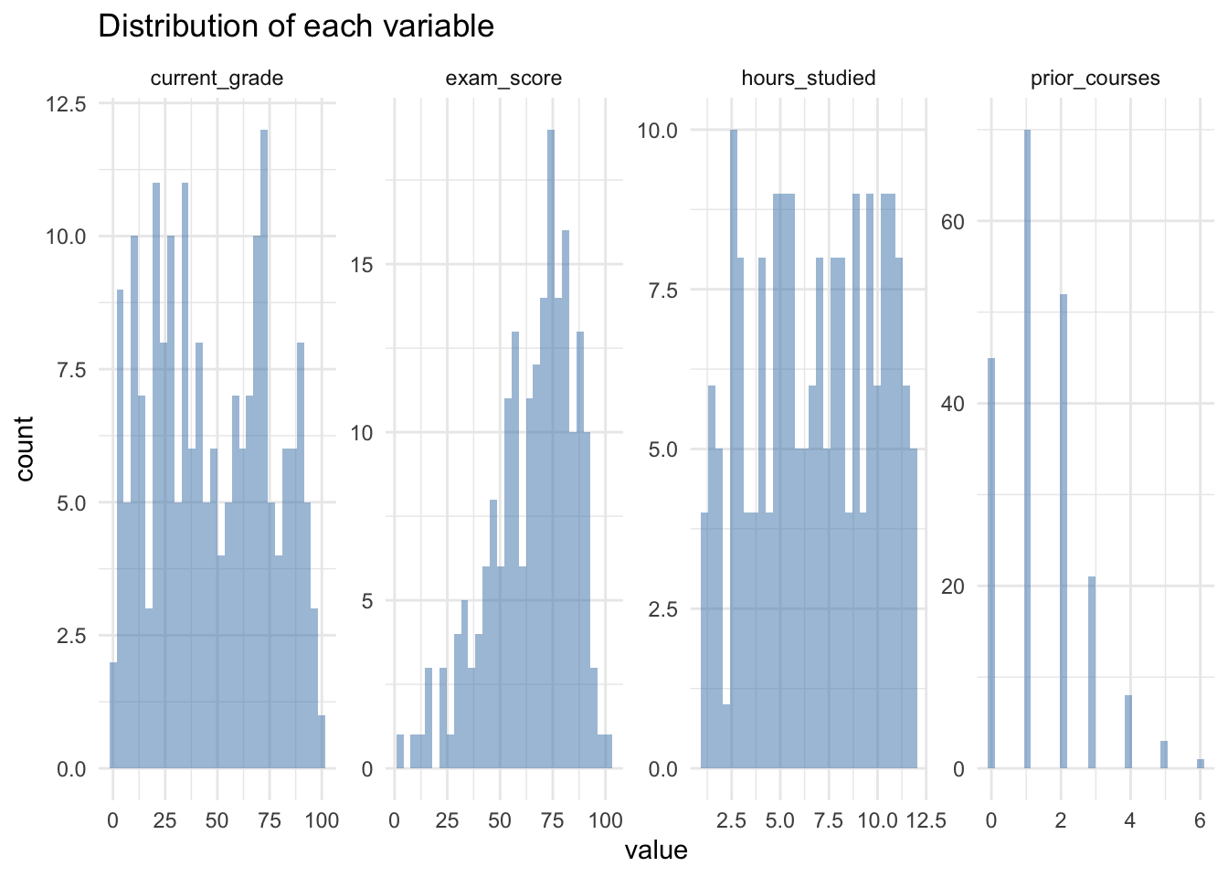
# A.3 Plot relationships with outcome
predictors <- c("current_grade", "prior_courses", "hours_studied")

for (pred in predictors) {
  p <- ggplot(df, aes(x = .data[[pred]], y = exam_score)) +
    geom_point(alpha = 0.6) +
    ggtitle(paste("exam_score vs", pred)) +
    theme_minimal()
  print(p)
}
Warning: Removed 5 rows containing missing values or values outside the scale range
(`geom_point()`).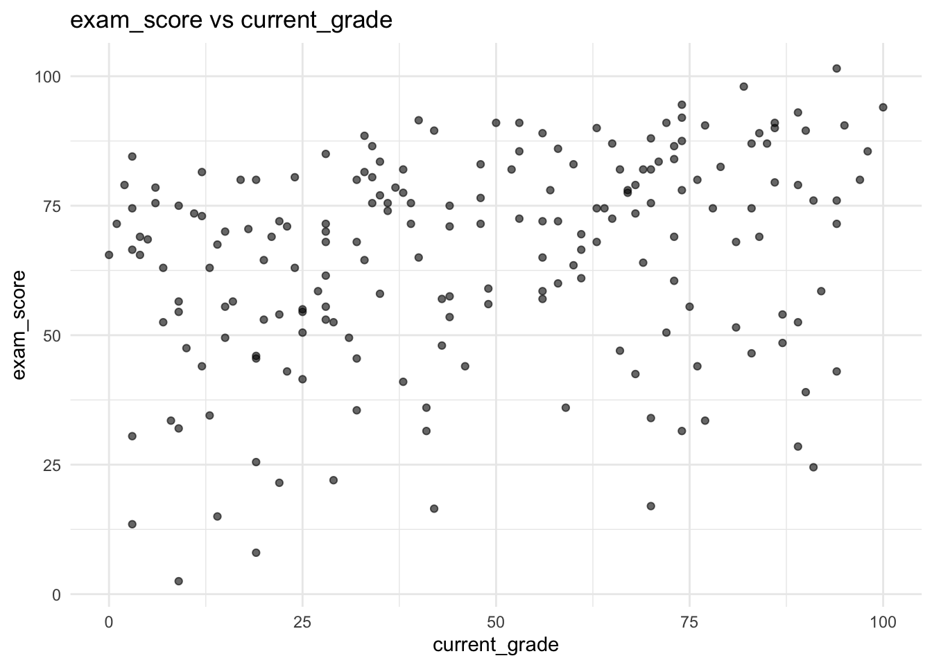
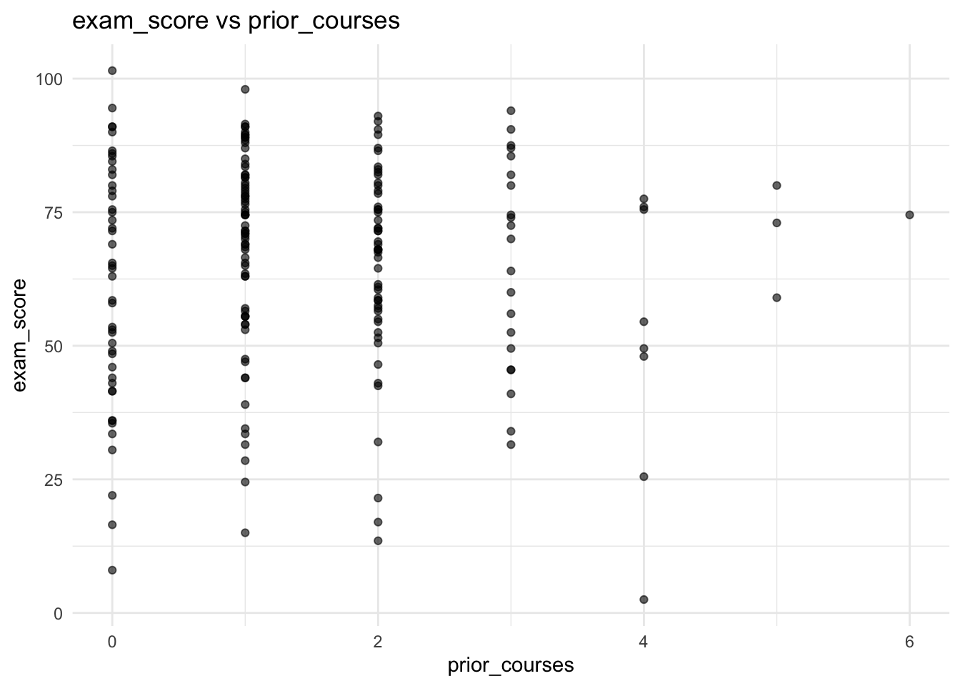
Warning: Removed 5 rows containing missing values or values outside the scale range
(`geom_point()`).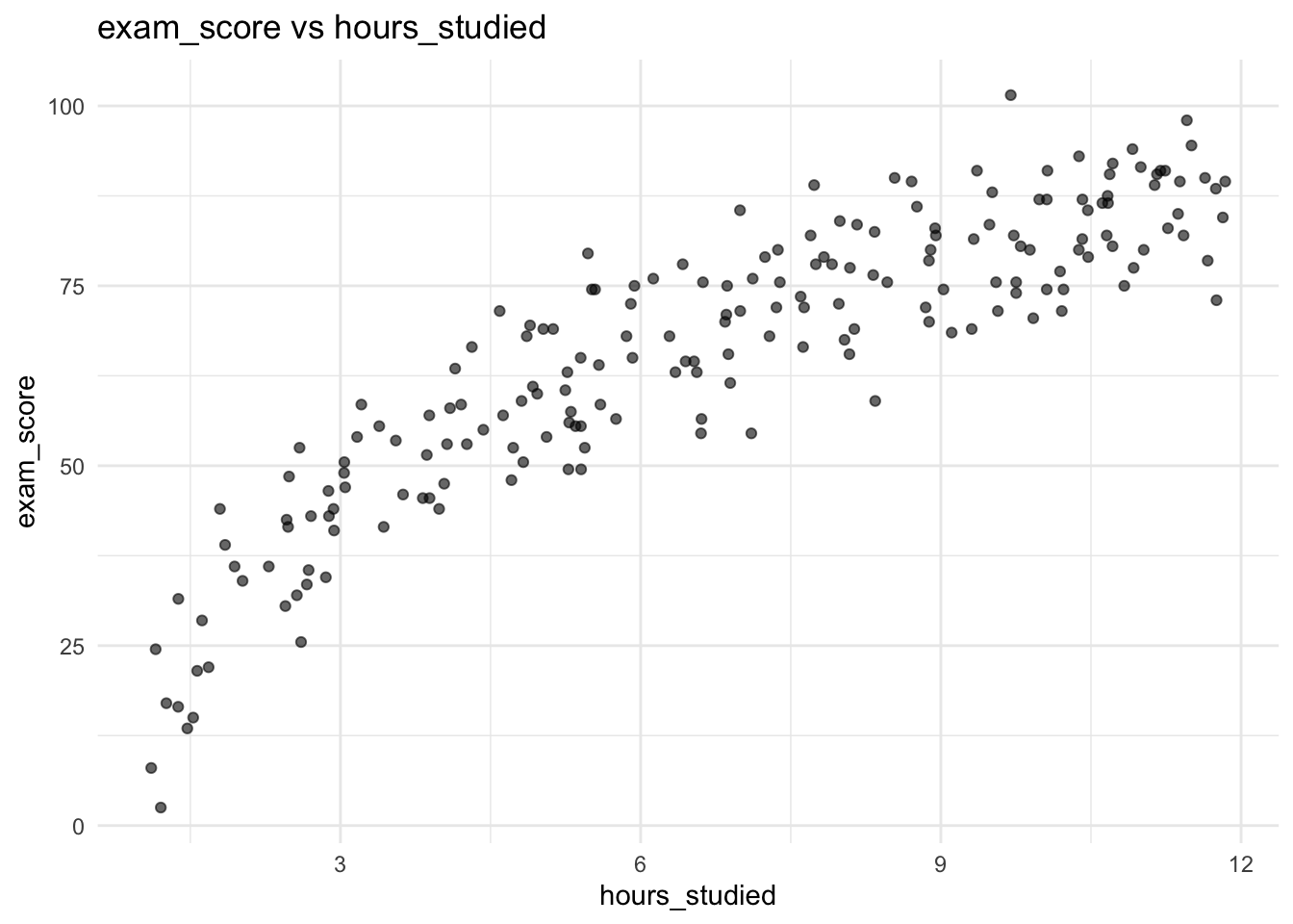
import numpy as np
import pandas as pd
import matplotlib.pyplot as plt
import seaborn as sns
import statsmodels.api as sm
from statsmodels.formula.api import ols
from scipy import stats

# Read data
# point this to the data location
df = pd.read_csv("./03-ols_files/simulations/problem-1-data.csv")

# A.1 Check for missing entries
print("Missing values:\n", df.isnull().sum())
Missing values:
current_grade 5
prior_courses 0
hours_studied 5
exam_score 0
dtype: int64# A.2 Plot histograms
fig, axes = plt.subplots(1, 4, figsize=(16, 4), dpi=300)
for i, col in enumerate(df.columns):
axes[i].hist(df[col], bins=30, alpha=0.5)
axes[i].set_title(f'Distribution of {col}')
plt.tight_layout()
plt.show()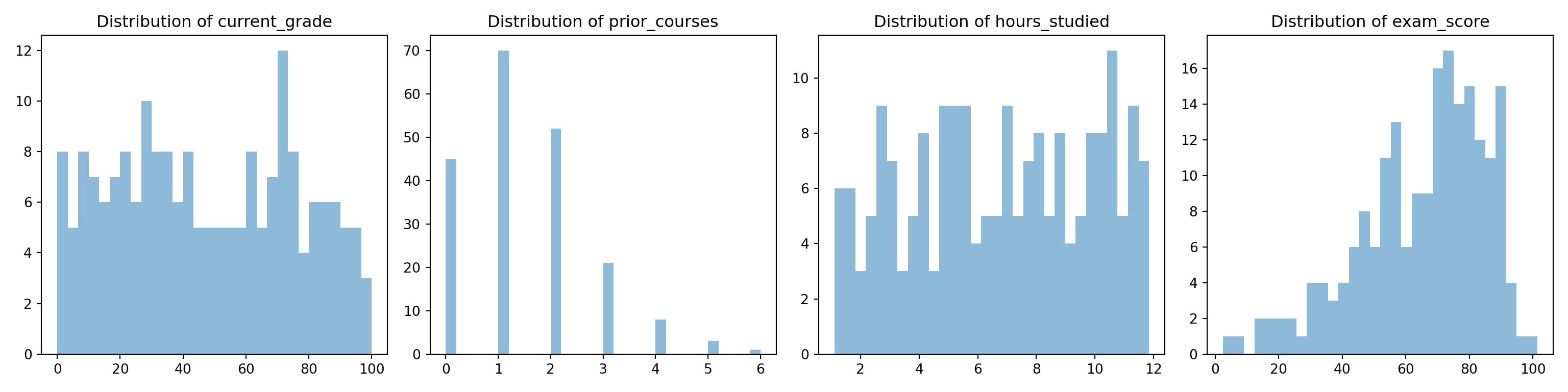
# A.3 Plot relationships with outcome
fig, axes = plt.subplots(1, 3, figsize=(15, 5), dpi=300)
predictors = ['current_grade', 'prior_courses', 'hours_studied']
for i, pred in enumerate(predictors):
    sns.scatterplot(data=df, x=pred, y='exam_score', ax=axes[i])
    axes[i].set_title(f'exam_score vs {pred}')
plt.tight_layout()
plt.show()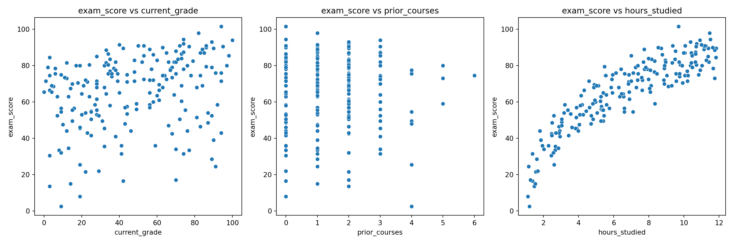
current_grade appears roughly uniform over its range, with no strong skew or extreme outliers. prior_courses is discrete and right-skewed, with most students having taken 0–2 prior courses and very few above 4. hours_studied is relatively uniform. exam_score is unimodal and left-skewed, with most scores concentrated between roughly 60 and 90. Now for the relationships with exam_score: exam_score vs current_grade shows a fairly weak positive trend, with a lot of noise. exam_score vs prior_courses shows strong variation at low integers, and no strong monotonic trend. This suggests a weak or nonlinear effect, and motivates categorical treatment. exam_score vs hours_studied is strongly increasing but clearly nonlinear, with diminishing returns at high study times. This is potentially consistent with a log-linear effect rather than a linear one.
B. Data Modelling
- Fit a multiple linear regression model predicting
exam_scoreusing the other variables. Display a statistics summary table. - Report the \(R^2\) value and coefficients. Do all of the coefficients match intuition? Can you find a plausible explantion for why they would not? We will revisit this.
- Plot residuals against the fitted values. Is heteroscedasticity present?
- Create a Q-Q plot of the residuals. Are they normally distributed?
Click to reveal answer
# B.1 Fit initial model
model1 <- lm(exam_score ~ current_grade + prior_courses + hours_studied, data = df)
summary(model1)
Call:
lm(formula = exam_score ~ current_grade + prior_courses + hours_studied,
    data = df)

Residuals:
     Min       1Q   Median       3Q      Max
-21.6836  -3.6079   0.7019   4.3444  13.4680

Coefficients:
              Estimate Std. Error t value Pr(>|t|)
(Intercept)   19.02669    1.40902   13.50  < 2e-16 ***
current_grade  0.22100    0.01649   13.40  < 2e-16 ***
prior_courses -2.29225    0.39655   -5.78 3.09e-08 ***
hours_studied  5.82093    0.14959   38.91  < 2e-16 ***
---
Signif. codes:  0 '***' 0.001 '**' 0.01 '*' 0.05 '.' 0.1 ' ' 1

Residual standard error: 6.337 on 186 degrees of freedom
  (10 observations deleted due to missingness)
Multiple R-squared:  0.9004,    Adjusted R-squared:  0.8988
F-statistic: 560.3 on 3 and 186 DF,  p-value: < 2.2e-16
R-squared: 0.900cat("Coefficients:\n")Coefficients: (Intercept) current_grade prior_courses hours_studied
19.0266898 0.2209959 -2.2922451 5.8209292 # B.3 Residuals vs Fitted
ggplot(data = NULL, aes(x = fitted(model1), y = resid(model1))) +
geom_point(alpha = 0.6) +
geom_smooth(method = "loess", se = FALSE, color = "blue") +
labs(x = "Fitted values", y = "Residuals", title = "Residuals vs Fitted") +
theme_minimal()`geom_smooth()` using formula = 'y ~ x'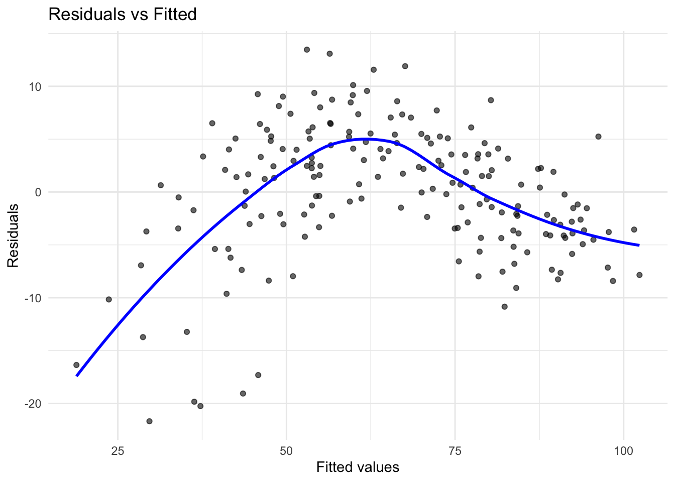
# B.4 Q-Q plot
ggplot(data = NULL, aes(sample = resid(model1))) +
  stat_qq(alpha = 0.6) +
  stat_qq_line(color = "red") +
  labs(title = "Q-Q Plot of Residuals") +
  theme_minimal()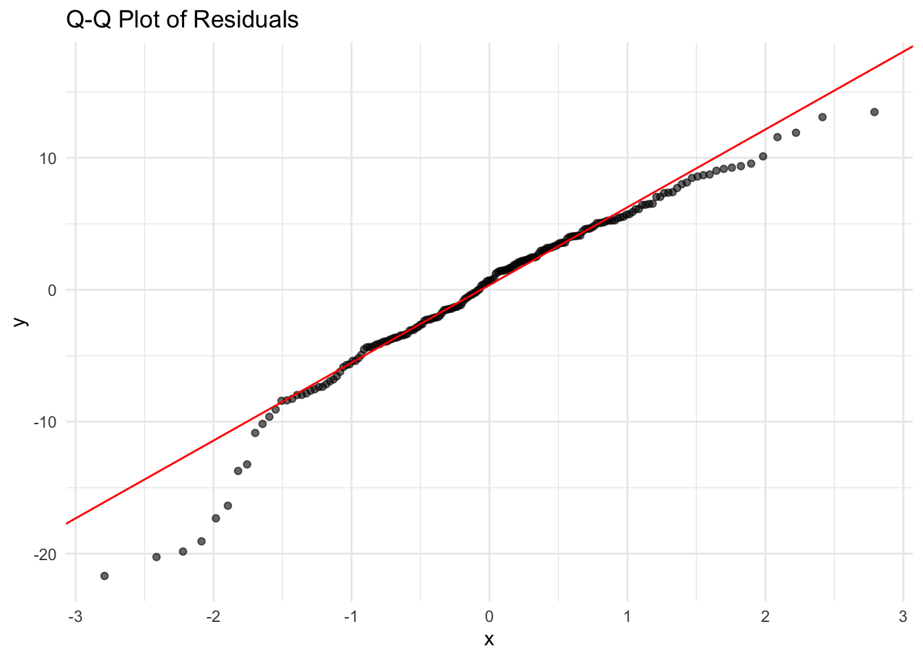
# B.1 Fit initial model
model1 = ols('exam_score ~ current_grade + prior_courses + hours_studied', data=df.dropna()).fit()
print(model1.summary())
OLS Regression Results
==============================================================================
Dep. Variable: exam_score R-squared: 0.900
Model: OLS Adj. R-squared: 0.899
Method: Least Squares F-statistic: 560.3
Date: Sat, 18 Jul 2026 Prob (F-statistic): 7.35e-93
Time: 12:18:10 Log-Likelihood: -618.40
No. Observations: 190 AIC: 1245.
Df Residuals: 186 BIC: 1258.
Df Model: 3
Covariance Type: nonrobust
=================================================================================
coef std err t P>|t| [0.025 0.975]
---------------------------------------------------------------------------------
Intercept 19.0267 1.409 13.503 0.000 16.247 21.806
current_grade 0.2210 0.016 13.403 0.000 0.188 0.254
prior_courses -2.2922 0.397 -5.780 0.000 -3.075 -1.510
hours_studied 5.8209 0.150 38.913 0.000 5.526 6.116
==============================================================================
Omnibus: 23.170 Durbin-Watson: 1.787
Prob(Omnibus): 0.000 Jarque-Bera (JB): 30.095
Skew: -0.775 Prob(JB): 2.92e-07
Kurtosis: 4.182 Cond. No. 171.
==============================================================================
Notes:
[1] Standard Errors assume that the covariance matrix of the errors is correctly specified.# B.2 Report R² and coefficients
print(f"\nR-squared: {model1.rsquared:.3f}")
R-squared: 0.900print("Coefficients:\n", model1.params)Coefficients:
Intercept 19.026690
current_grade 0.220996
prior_courses -2.292245
hours_studied 5.820929
dtype: float64# B.3 Residuals vs fitted
sns.residplot(x=model1.fittedvalues, y=model1.resid, lowess=True)
plt.xlabel('Fitted values')
plt.ylabel('Residuals')
plt.title('Residuals vs Fitted')
plt.show()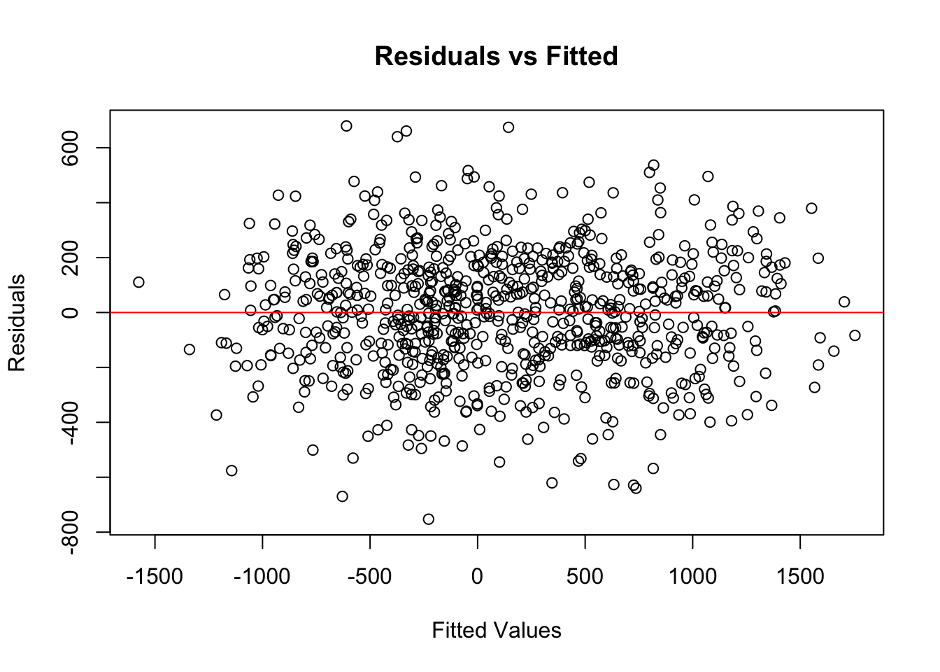
# B.4 Q-Q plot
sm.qqplot(model1.resid, line='45')
plt.title('Q-Q Plot of Residuals')
plt.show()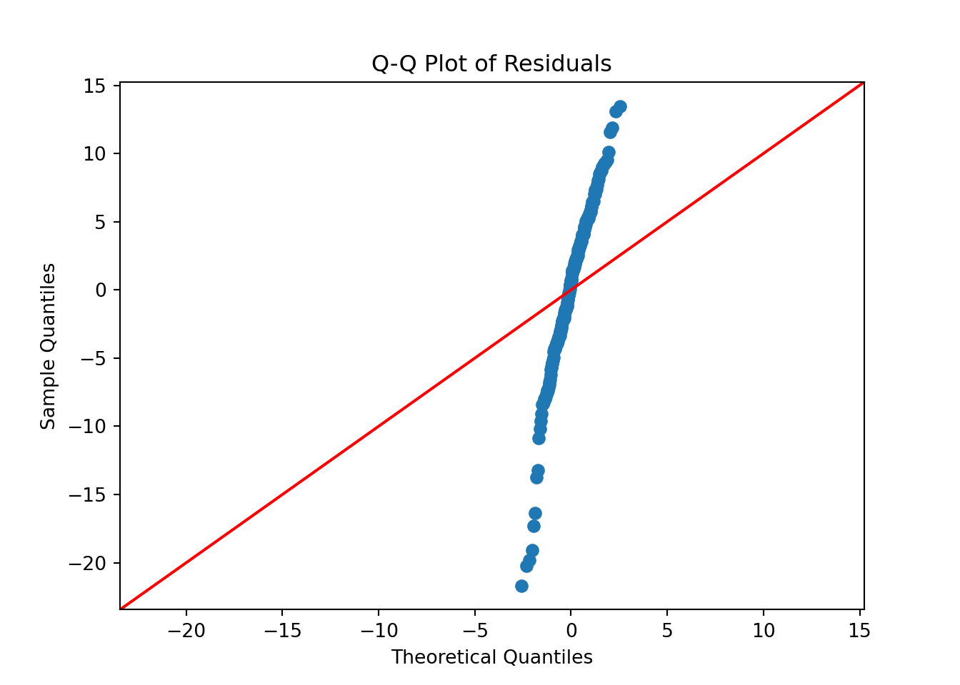
The coefficients do not entirely match intuition—prior_courses comes out negative in the linear model. A plausible explanation could be a selection bias: students who took more prior courses may be doing so because they struggled previously, leading to lower exam scores. Or, pior_courses is a poor linear proxy.
Heteroscedasticity appears present in the residuals vs fitted plot and the Breusch-Pagan test, which shown non-constant variance. The Q-Q plot shows residuals which deviate from a normal distribution.
C. Goodness of Fit
- Perform the Durbin-Watson test to check for autocorrelation in the residuals. What does the test statistic tell you about the independence of errors assumption?
- Test for Homoscedasticity: You already plotted residuals against fitted values. Perform the Breusch-Pagan test to formally assess homoscedasticity. What does the p-value of the test indicate about the model?
- Identify Outliers: Create a plot of the residuals against the observation index. Does this plot reveal any obvious outliers or problematic patterns?
- Check for Influential Points: Calculate and plot the Cook’s Distance for each observation. Are there any data points that have a disproportionately large influence on the model’s coefficients?
Click to reveal answer
# C.1 Durbin-Watson Test (Independence)

dw <- dwtest(model1)
print(dw$statistic)
DW
1.787067 # C.2 Breusch-Pagan Test (Homoscedasticity)
bp <- bptest(model1)
print(bp$statistic) BP
26.76084 print(bp$p.value) BP
6.607713e-06 # C.3 Residuals vs Observation Index
# Create data frame for index plotting
df_diag <- data.frame(
resid = residuals(model1),
index = 1:length(residuals(model1)),
cooks = cooks.distance(model1)
)
ggplot(df_diag, aes(x = index, y = resid)) +
geom_point(alpha = 0.7) +
geom_hline(yintercept = 0, color = "red", linetype = "dashed") +
labs(title = "Residual Plot vs. Observation Index",
x = "Observation Index", y = "Residuals") +
theme_minimal()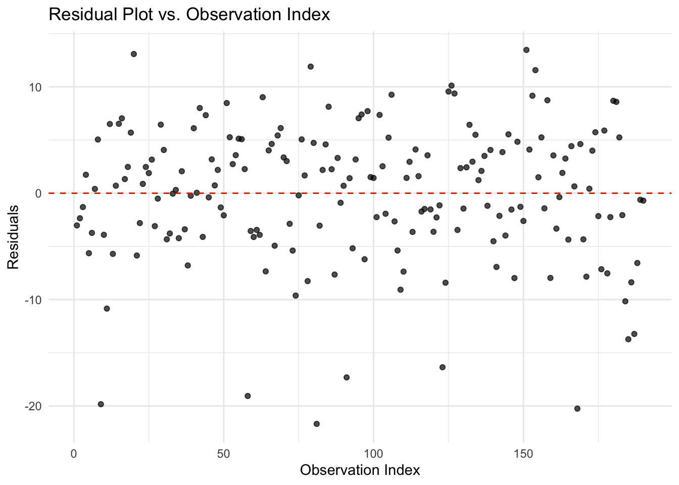
# C.4 Cook's Distance

ggplot(df_diag, aes(x = index, y = cooks)) +
geom_segment(aes(xend = index, yend = 0)) +
geom_point() +
geom_hline(yintercept = 0.5, color = "red", linetype = "dashed") +
labs(title = "Cook's Distance", x = "Observation Index", y = "Cook's Distance") +
theme_minimal()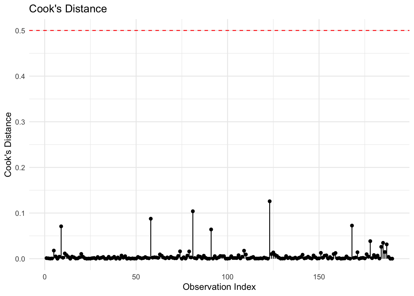
import statsmodels.stats.api as sms
# C.1 Perform the Durbin-Watson test...
dw_stat = durbin_watson(model1.resid)
print(f"Durbin-Watson statistic: {dw_stat:.4f}")
Durbin-Watson statistic: 1.7871# C.2 Perform the Breusch-Pagan test...
from statsmodels.stats.diagnostic import het_breuschpagan
# Perform Breusch-Pagan test
bp_test = het_breuschpagan(model1.resid, model1.model.exog)
# Unpack results
bp_stat, bp_pvalue, empty, empty = bp_test
print(f"Breusch-Pagan test statistic: {bp_stat:.3f}")Breusch-Pagan test statistic: 26.761print(f"P-value: {bp_pvalue:.4f}")P-value: 0.0000# bp_test = sms.het_breuschpagan(residuals, model.model.exog)
# labels = ['LM Statistic', 'LM-Test p-value', 'F-Statistic', 'F-Test p-value']
# bp_results = dict(zip(labels, bp_test))
# print(f"Breusch-Pagan test p-value: {bp_results['LM-Test p-value']:.4f}")
#
# C.3 Plot the residuals against the observation index...
plt.figure(figsize=(6, 4))
plt.plot(residuals, marker='o', linestyle='none', alpha=0.7)
plt.axhline(y=0, color='red', linestyle='--')
plt.title("Residual Plot vs. Observation Index")
plt.xlabel("Observation Index")
plt.ylabel("Residuals")
plt.tight_layout()
plt.show()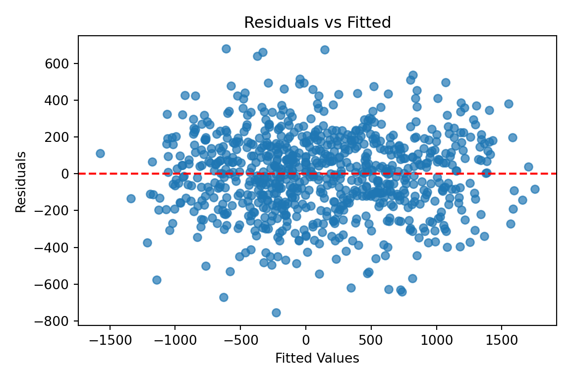
# C.4 Calculate and plot Cook's Distance...
influence = model.get_influence()
cooks_d = influence.cooks_distance[0]

plt.figure(figsize=(6, 4))
# use_line_collection=True is for compatibility
plt.stem(np.arange(len(cooks_d)), cooks_d, markerfmt=",")
plt.axhline(y=0.5, color='red', linestyle='--', label='Threshold (0.5)')
plt.title("Cook's Distance")
plt.xlabel("Observation Index")
plt.ylabel("Cook's Distance")
plt.legend()
plt.tight_layout()
plt.show()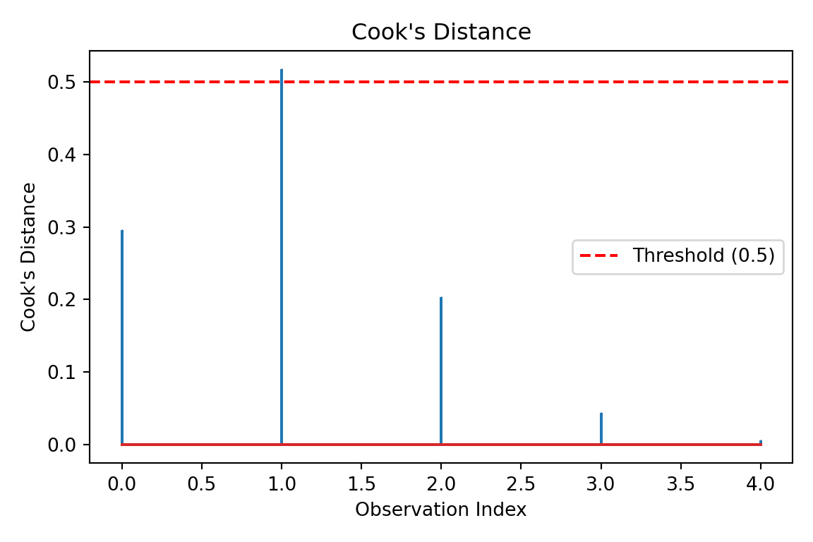
The Durbin-Watson test produces a value of 1.79, close to 2, meaning there is no strong evidence of autocorrelation (errors are approximately independent). The p-value of the Breusch-Pagan test is essentially 0, and thus we reject homoscedasticity: residual variance changes with fitted values. Looking at the residuals vs observation index, there is no obvious time/order pattern implied here. Using Cook’s Distance plot, there are no point that appear to have disproportionately large influence on the fitted coefficients.
D. Data Modelling - Improvements
- Should
prior_coursesbe converted to another variable type? If so, why and which one? If you answered yes, try converting it and re-fit. Do you notice any improvements? - Create
log_hours_studied, the log ofhours_studied. Re-fit the OLS using this predictor instead. Does \(R^2\) improve? > Hint: the true data generation process usedlog(hours_studied)! - Add an interaction term,
current_grade * prior_coursesand re-fit. Is this interaction significant?
Click to reveal answer
# D.1 prior_courses is an integer. We can try convert prior_courses to categorical and fit the model again:
df <- df %>% mutate(prior_courses_category = factor(prior_courses))

model2 <- lm(exam_score ~ current_grade + prior_courses_category + hours_studied, data = df)
cat("Model 2:\n")
Model 2:summary(model2)
Call:
lm(formula = exam_score ~ current_grade + prior_courses_category +
    hours_studied, data = df)

Residuals:
     Min       1Q   Median       3Q      Max
-20.9321  -3.1306   0.2158   4.3482  12.7484

Coefficients:
                         Estimate Std. Error t value Pr(>|t|)
(Intercept)              17.81383    1.53192  11.628  < 2e-16 ***
current_grade             0.21710    0.01669  13.007  < 2e-16 ***
prior_courses_category1  -0.34711    1.25488  -0.277  0.78240
prior_courses_category2  -2.41685    1.35086  -1.789  0.07527 .
prior_courses_category3  -4.80176    1.74599  -2.750  0.00656 **
prior_courses_category4  -9.94565    2.44134  -4.074 6.91e-05 ***
prior_courses_category5 -13.86771    4.62599  -2.998  0.00310 **
prior_courses_category6 -19.77704    6.44826  -3.067  0.00249 **
hours_studied             5.82145    0.15179  38.351  < 2e-16 ***
---
Signif. codes:  0 '***' 0.001 '**' 0.01 '*' 0.05 '.' 0.1 ' ' 1

Residual standard error: 6.312 on 181 degrees of freedom
  (10 observations deleted due to missingness)
Multiple R-squared:  0.9038,    Adjusted R-squared:  0.8996
F-statistic: 212.6 on 8 and 181 DF, p-value: < 2.2e-16cat("##########################################################\n")########################################################### D.2 Log transform hours_studied and fit model
df <- df %>% mutate(log_hours = log(hours_studied))
model3 <- lm(exam_score ~ current_grade + prior_courses + log_hours, data = df)
cat("Model 3:\n")Model 3:summary(model3)
Call:
lm(formula = exam_score ~ current_grade + prior_courses + log_hours,
    data = df)

Residuals:
    Min      1Q  Median      3Q     Max
-8.5498 -2.3069  0.1171  1.8023  9.1291

Coefficients:
               Estimate Std. Error t value Pr(>|t|)
(Intercept)    2.064443   0.874596    2.36   0.0193 *
current_grade  0.222380   0.008533   26.06   <2e-16 ***
prior_courses -2.487138   0.205384  -12.11   <2e-16 ***
log_hours     31.958236   0.407101   78.50   <2e-16 ***
---
Signif. codes:  0 '***' 0.001 '**' 0.01 '*' 0.05 '.' 0.1 ' ' 1

Residual standard error: 3.28 on 186 degrees of freedom
  (10 observations deleted due to missingness)
Multiple R-squared:  0.9733,    Adjusted R-squared:  0.9729
F-statistic: 2262 on 3 and 186 DF, p-value: < 2.2e-16cat("##########################################################\n")########################################################### D.3 Add interaction term
model4 <- lm(exam_score ~ current_grade * prior_courses + hours_studied, data = df)
cat("Model 4:\n")Model 4:summary(model4)
Call:
lm(formula = exam_score ~ current_grade * prior_courses + hours_studied,
    data = df)

Residuals:
     Min       1Q   Median       3Q      Max
-21.5523  -3.5381   0.6858   4.3840  13.4922

Coefficients:
                            Estimate Std. Error t value Pr(>|t|)
(Intercept)                 18.80963    1.73495  10.842  < 2e-16 ***
current_grade                0.22527    0.02583   8.722 1.56e-15 ***
prior_courses               -2.14965    0.77195  -2.785  0.00592 **
hours_studied                5.82504    0.15118  38.531  < 2e-16 ***
current_grade:prior_courses -0.00304    0.01411  -0.216  0.82961
---
Signif. codes:  0 '***' 0.001 '**' 0.01 '*' 0.05 '.' 0.1 ' ' 1

Residual standard error: 6.354 on 185 degrees of freedom
  (10 observations deleted due to missingness)
Multiple R-squared:  0.9004,    Adjusted R-squared:  0.8982
F-statistic: 418.1 on 4 and 185 DF,  p-value: < 2.2e-16
# D.1 prior_courses is an integer. We can try convert prior_courses to categorical and fit the model again:
df["prior_courses_category"] = df['prior_courses'].astype('category')
model2 = ols('exam_score ~ current_grade + prior_courses_category + hours_studied',
data=df.dropna()).fit()
print(model2.summary()) OLS Regression Results
==============================================================================
Dep. Variable: exam_score R-squared: 0.904
Model: OLS Adj. R-squared: 0.900
Method: Least Squares F-statistic: 212.6
Date: Sat, 18 Jul 2026 Prob (F-statistic): 9.11e-88
Time: 12:18:11 Log-Likelihood: -615.06
No. Observations: 190 AIC: 1248.
Df Residuals: 181 BIC: 1277.
Df Model: 8
Covariance Type: nonrobust
=================================================================================================
coef std err t P>|t| [0.025 0.975]
-------------------------------------------------------------------------------------------------
Intercept 17.8138 1.532 11.628 0.000 14.791 20.837
prior_courses_category[T.1.0] -0.3471 1.255 -0.277 0.782 -2.823 2.129
prior_courses_category[T.2.0] -2.4168 1.351 -1.789 0.075 -5.082 0.249
prior_courses_category[T.3.0] -4.8018 1.746 -2.750 0.007 -8.247 -1.357
prior_courses_category[T.4.0] -9.9456 2.441 -4.074 0.000 -14.763 -5.129
prior_courses_category[T.5.0] -13.8677 4.626 -2.998 0.003 -22.996 -4.740
prior_courses_category[T.6.0] -19.7770 6.448 -3.067 0.002 -32.500 -7.054
current_grade 0.2171 0.017 13.007 0.000 0.184 0.250
hours_studied 5.8215 0.152 38.351 0.000 5.522 6.121
==============================================================================
Omnibus: 24.086 Durbin-Watson: 1.757
Prob(Omnibus): 0.000 Jarque-Bera (JB): 31.292
Skew: -0.803 Prob(JB): 1.60e-07
Kurtosis: 4.171 Cond. No. 783.
==============================================================================
Notes:
[1] Standard Errors assume that the covariance matrix of the errors is correctly specified.print("##########################################################")########################################################### D.2 Log transform hours_studied
df['log_hours'] = np.log(df['hours_studied'])
model3 = ols('exam_score ~ current_grade + prior_courses + log_hours',
data=df.dropna()).fit()
print(model3.summary()) OLS Regression Results
==============================================================================
Dep. Variable: exam_score R-squared: 0.973
Model: OLS Adj. R-squared: 0.973
Method: Least Squares F-statistic: 2262.
Date: Sat, 18 Jul 2026 Prob (F-statistic): 4.70e-146
Time: 12:18:11 Log-Likelihood: -493.24
No. Observations: 190 AIC: 994.5
Df Residuals: 186 BIC: 1007.
Df Model: 3
Covariance Type: nonrobust
=================================================================================
coef std err t P>|t| [0.025 0.975]
---------------------------------------------------------------------------------
Intercept 2.0644 0.875 2.360 0.019 0.339 3.790
current_grade 0.2224 0.009 26.060 0.000 0.206 0.239
prior_courses -2.4871 0.205 -12.110 0.000 -2.892 -2.082
log_hours 31.9582 0.407 78.502 0.000 31.155 32.761
==============================================================================
Omnibus: 0.248 Durbin-Watson: 2.061
Prob(Omnibus): 0.883 Jarque-Bera (JB): 0.358
Skew: 0.077 Prob(JB): 0.836
Kurtosis: 2.853 Cond. No. 217.
==============================================================================
Notes:
[1] Standard Errors assume that the covariance matrix of the errors is correctly specified.print("##########################################################")########################################################### D.3 Add interaction term
model4 = ols('exam_score ~ current_grade * prior_courses + hours_studied',
data=df.dropna()).fit()
print(model4.summary()) OLS Regression Results
==============================================================================
Dep. Variable: exam_score R-squared: 0.900
Model: OLS Adj. R-squared: 0.898
Method: Least Squares F-statistic: 418.1
Date: Sat, 18 Jul 2026 Prob (F-statistic): 1.85e-91
Time: 12:18:11 Log-Likelihood: -618.38
No. Observations: 190 AIC: 1247.
Df Residuals: 185 BIC: 1263.
Df Model: 4
Covariance Type: nonrobust
===============================================================================================
coef std err t P>|t| [0.025 0.975]
-----------------------------------------------------------------------------------------------
Intercept 18.8096 1.735 10.842 0.000 15.387 22.232
current_grade 0.2253 0.026 8.722 0.000 0.174 0.276
prior_courses -2.1496 0.772 -2.785 0.006 -3.673 -0.627
current_grade:prior_courses -0.0030 0.014 -0.216 0.830 -0.031 0.025
hours_studied 5.8250 0.151 38.531 0.000 5.527 6.123
==============================================================================
Omnibus: 23.090 Durbin-Watson: 1.783
Prob(Omnibus): 0.000 Jarque-Bera (JB): 29.962
Skew: -0.774 Prob(JB): 3.12e-07
Kurtosis: 4.179 Cond. No. 457.
==============================================================================
Notes:
[1] Standard Errors assume that the covariance matrix of the errors is correctly specified.prior_courses should be converted to categorical, because it is discrete and its relationship with exam_score isn’t clearly linear. We see that this gives a small improvement in the fit (\(R^2\) increases). Following the log-transform of hours_studied, \(R^2\) improves and reaches 0.973. This is consistent with diminishing returns in studying. The current_grade * prior_courses interaction is not very significant, having a p-value of 0.830. There is therefore no evidence of a dependence of current_grade on prior_courses here.
E. Final Evaluation
- Select the final best performing model from the combinations of improvements above, by comparing \(R^2\) and RMSE.
- Interpret the final model: How does a 5% increase in
current_gradeaffectexam_score? - Why might having taken more
prior_coursesshow diminishing returns inexam_score? - Inference: Based on your final model, describe the relationship between
hours_studiedandexam_score. Namely, if a student increases their study time by 10%, how does their expected exam score change? - Prediction: Suppose a student has a current grade of 82, has taken 2 prior programming courses, and studied for 12.5 hours. Based on your final model, what is the predicted exam score of this student?
Click to reveal answer
# E.1 Compare models
# Create a comparison table of R² and RMSE
models <- list(
  Initial = model1,
  Categorical = model2,
  Log_Transform = model3,
  Interaction = model4
)

results <- tibble(
  Model = names(models),
  R_squared = sapply(models, function(m) summary(m)$r.squared),
  RMSE = sapply(models, function(m) sqrt(mean(resid(m)^2)))
)

# Show models sorted by R-squared
results %>% arrange(desc(R_squared)) %>% print()
# A tibble: 4 × 3
Model R_squared RMSE
<chr> <dbl> <dbl>
1 Log_Transform 0.973 3.24
2 Categorical 0.904 6.16
3 Interaction 0.900 6.27
4 Initial 0.900 6.27# E.2 Interpretation of final model (model3)
# Interpretation: effect of a 5% increase in current_grade
coef <- coef(model3)["current_grade"]
effect <- 0.05 * coef
cat(sprintf("\nA 5%% increase in current_grade increases exam_score by %.5f points\n", effect))
A 5% increase in current_grade increases exam_score by 0.01112 points# E.3 Diminishing returns explanation
# see below!
# E.4 Inference: Effect of hours_studied
# Since Model 3 uses log(hours_studied), this is a Level-Log interpretation.
# A 10% increase in X is associated with a (beta / 100) change in Y.
# Delta Y = beta * ln(1 + 0.10)
coef_log_hours <- coef(model3)["log_hours"]
effect_hours <- coef_log_hours * log(1.10)
cat("\nA 10% increase in study time is associated with an exam_score increase of:\n")
A 10% increase in study time is associated with an exam_score increase of:print(effect_hours)log_hours
3.045945 # E.5 Prediction
# Define the new student profile
new_student <- data.frame(
current_grade = 82,
prior_courses = 2,
hours_studied = 12.5
)
# Note: model3 was trained on a dataframe with a 'log_hours' column.
# We must create that column in the new data to predict successfully.
new_student <- new_student %>%
mutate(log_hours = log(hours_studied))
predicted_score <- predict(model3, newdata = new_student)
cat(sprintf("\nPredicted exam score for the student: %.2f\n", predicted_score))
Predicted exam score for the student: 96.04Comparing \(R^2\) and RMSE, one should choose the Log Transform model, which has the highest \(R^2=0.9733\) and lowest RMSE\(\approx3.28\).
-
There are a number of plausible explanations for why taking more prior courses may show diminishing returns:
- Students who have taken many prior courses may be repeating courses due to past struggles, indicating a negative selection bias.
- The knowledge gained from additional courses may overlap, leading to less incremental benefit for each additional course taken.
- Students with many prior courses may have less time or motivation (or more overconfidence!) to study effectively for the current course.
# E.1 Compare models
models = {
    'Initial': model1,
    'Categorical': model2,
    'Log Transform': model3,
    'Interaction': model4
}

results = pd.DataFrame({
    'Model': models.keys(),
    'R-squared': [m.rsquared for m in models.values()],
    'RMSE': [np.sqrt(m.mse_resid) for m in models.values()]
})
print(results.sort_values('R-squared', ascending=False))
Model R-squared RMSE
2 Log Transform 0.973318 3.279605
1 Categorical 0.903819 6.312044
3 Interaction 0.900395 6.353581
0 Initial 0.900370 6.337274# E.2 Interpretation of final model (model3)
final_model = model3
coef = final_model.params['current_grade']
print(f"\nA 5% increase in current_grade increases exam_score by {0.05*coef:.5f} points")
A 5% increase in current_grade increases exam_score by 0.01112 points# E.3 Diminishing returns explanation
# see below!
# E.4 Inference: Effect of hours_studied (10% increase)
# Interpretation of Level-Log model: Delta Y = beta * ln(1.10)
coef_log_hours = final_model.params['log_hours']
effect_hours = coef_log_hours * np.log(1.10)
print("\nA 10% increase in study time is associated with an exam_score increase of:")
A 10% increase in study time is associated with an exam_score increase of:print(effect_hours)3.0459452256912294# E.5 Prediction
# Create a DataFrame for the new student
new_student = pd.DataFrame({
'current_grade': [82],
'prior_courses': [2],
'hours_studied': [12.5]
})
# We must add the log_hours feature as used in model3 training
new_student['log_hours'] = np.log(new_student['hours_studied'])
# Predict
prediction = final_model.predict(new_student)
print("\nPredicted exam score for the student:")
Predicted exam score for the student:print(prediction[0])96.04319041340568Comparing \(R^2\) and RMSE, one should choose the Log Transform model, which has the highest \(R^2=0.9733\) and lowest RMSE\(\approx3.28\).
-
There are a number of plausible explanations for why taking more prior courses may show diminishing returns:
- Students who have taken many prior courses may be repeating courses due to past struggles, indicating a negative selection bias.
- The knowledge gained from additional courses may overlap, leading to less incremental benefit for each additional course taken.
- Students with many prior courses may have less time or motivation (or more overconfidence!) to study effectively for the current course.